How Viamedia Transformed Their Way of Managing a Distributed Sales Team

Hot off the press! This one’s a real page turner!

With the help of our VIPs - Larry Bell and Lynn Finke of Viamedia - we’ve put together another incredible success story that will have you on the edge of your seat.

In this story, we explored how Viamedia partnered with Dundas to implement a Business Intelligence application that has allowed them to better manage their distributed Sales team, and truly focus on achieving their goals. As a result, they’ve been able to collaborate and coach more effectively, have deeper insight into their data and what’s effecting performance, and are making data-driven decisions that have a measurable impact on the business.

Larry Bell is the Senior Programmer - Business Intelligence at Viamedia in Kentucky, and Lynn Finke is the Vice President of Analytics. They’ve been customers of Dundas since the early Dundas Dashboard days, and have since migrated to Dundas BI.

Viamedia Success Story <<< Read the story

After checking out the case study, feel free to leave any questions or comments for Larry and Lynn below!

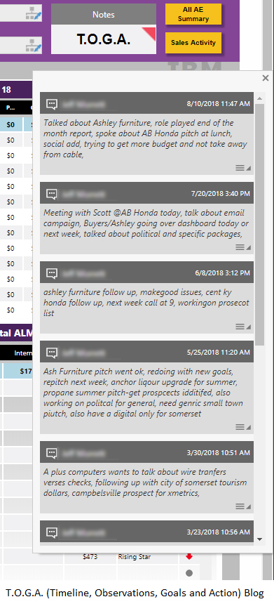
If anyone is interested in learning how Larry built a blog-like function into his solution, check out this post

The link does not work for me. :sob:

I also use company colors in my Dashboards, I think it is great to see others do the same.

Whoops! Try again now!

:smiley_cat: it is working now thanks

Great story, Good Luck

Great story - nice looking dashboard, although I personally don’t like pies with more than about 3 slices.

Pretty impressive! Great work! Keep it up!

Sometime we got to do them because that what the end user (the person that can fire you) wants.
I showed someone a Sankey diagram that perfectly answered their question. I got told “I do not want to have to go back to college to learn how to read your chart”. This person did say that maybe some one else would like so keep it but make them something else.

1 Like

Educating end-users is always a challenge and sometimes the answer is indeed to just do what they are comfortable with. That said, in the case where there a couple of options to visualize the data, I recommend adding a radio button or some kind of another button that will allow them to easily switch the type of visualization - for example like on this dashboard - some will prefer the funnel chart and some will prefer trend chart. Using this button, you can start promoting the idea and sometimes (if you are lucky) get a case where you can show them how one is showing things that other doesn’t.

Utilizing the notes for data points looks very interesting. We have a similar need to allow (and encourage) users to comment on data - this case study is a very good example of showing the possibility there.

I gotta say those dashboards look really tidy, Im really interested to know how you did the scrolling comments/noticeboard thing. Great success story!

Truly inspired and will be using some of these design ideas in my future reports with the company colours and stuff. Awesome !

This is actually built-in functionality in Dundas BI that Larry took advantage of. You can read more about that, here.

As for how exactly it was accomplished in this case, @larry.bell may be better suited at answering that than myself :slight_smile:

1 Like

Very nice , I liked the idea of using responsive design for the dashboards.

just wonderfull, powerfull responsive dashboard.
It well design and easy to read!

Really nice dashboards. So easy to to view

Good stuff. Decent use of mobile.

impressive dashboard

really like the use of the notations for adding extra info to the data.

Live blog is a great idea for a sales team.