When showing data in a granularity that can repeat itself (i.e., quarterly level data across multiple years), your labels can get quite long if showing the full label for each data point (i.e. “Q1, 2017” and then “Q2, 2017” and so on).
So, instead of creating very long labels that makes it harder to read, you may want to show different levels of your data using grouping labels at the higher levels.
I believe the following picture will describe this capability best:
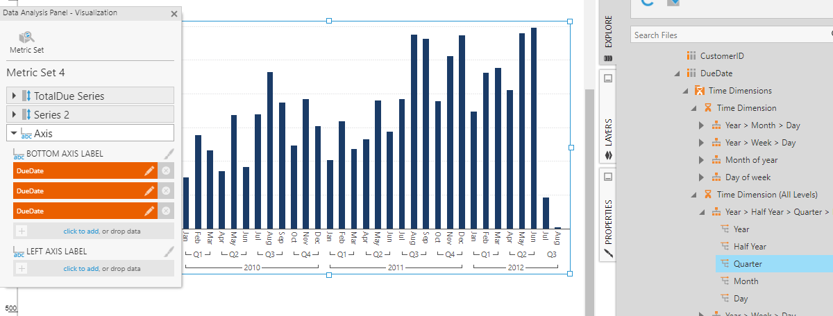
As you can see - the bottom axis is grouping the data by quarters and then by years. To achieve this kind of grouping, simply drag a time dimension level directly onto the "Bottom Axis Label" to display just that level as its own row.