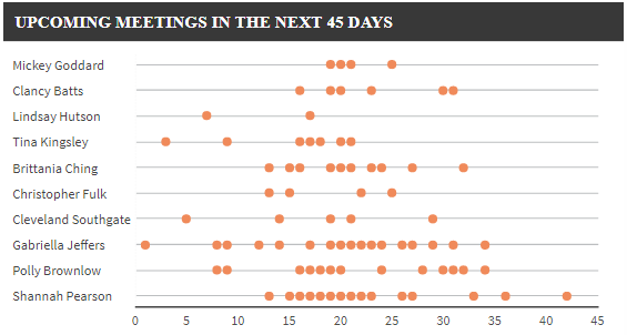
Points charts may be quite handy for situations where you want to show an occurrence of a certain event and the frequency of that event.
For example – showing the frequency of the scheduled sales meetings your sales team has scheduled by sales person (see image) or showing the attendance of people at different events or showing different manufacturing machines downtime events.
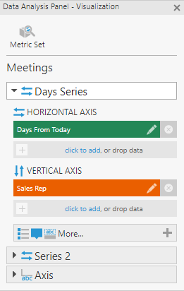
To create this visual, all you need is to re-visualize your metric set to use a point chart, and then define the metric set visualization to have the measure on the "Horizontal Axis" and your dimensions on the "Vertical Axis"