Do you have a chart or table on your dashboard / report that just isn’t looking like you’d expect it to? Are there bars in the wrong places? Is the data not what you expected?
There is a massive amount of customization that can go into your visualization after the Metric Set, before you see a visual on the screen. Here’s the flow:
- 1 - Metric Set - Defines the data being used in the visualization
- 2 - Visualization - Defines what we do with the data from the Metric Set
- 3 - Properties - Provides settings specific to the visualization type that you are using
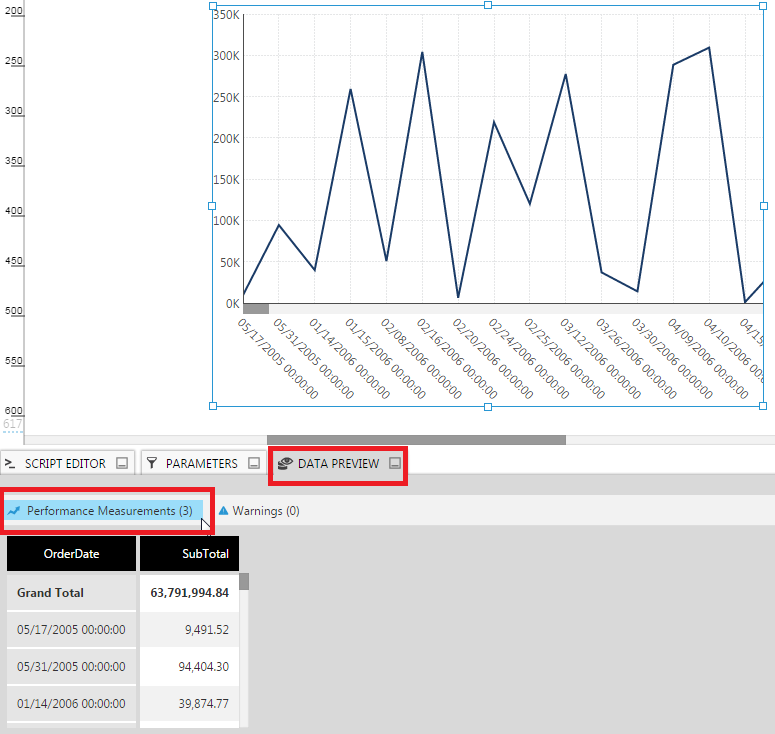
If you are seeing something unexpected, start with the Data Preview as it will tell you if the problem is with your data or with the settings that you have selected from the Visualization or the Properties .
We’ve seen a lot of people spending time tweaking properties, think that there’s an issue with the visualization on the dashboard they’re using, when in actuality, the problem was something with their data. Use this tip to start looking at the right place from the beginning!