Size Legend for Bubble Chart

Has the option to show a Size Legend for a Bubble Chart been added? I know there was a request (ref77505) last year to do so.

If not, any smart ideas on how to do a temp work around? It would really help to give some sense of the size in a chart like this (and has been in other BI programs for a while). Thanks!

Hi Christopher,

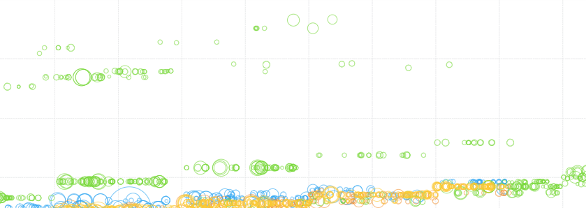
I can’t find that request and 77505 is not the right number, but we did have a request for this internally and I’ve added you to that now. It makes sense to be able to do this with bubble charts like you already can with ‘bubbles’ on maps, etc., but historically bubble charts have not normally relied on this and it had not been requested yet. Even with a legend, intuiting the values associated with varying sizes is always a challenge and tooltips are probably the best bet for making sense of a particular size.

Since bubbles are sized relative to zero, the main value of interest might be the largest one. To help make sense of the values you might try displaying this in a data label, or use states to display it on the largest value (where it equals the result of the TOP formula).

@christopher.simpson Just to add for reference, the ticket number for the feature request Jamie added you to is Issue 74669, so you can monitor it on the support site.

Thank you both. I will try to finagle a top/bottom approximation.

Something like this, where you have min/max and a representative one or two in between is what I am hoping for.

image

Sounds good! Feel free to keep the thread going in case you do run into issues with the alternative - always happy to help!