Showing a 24 hour period on the x axis, when data doesn't include entire time range?

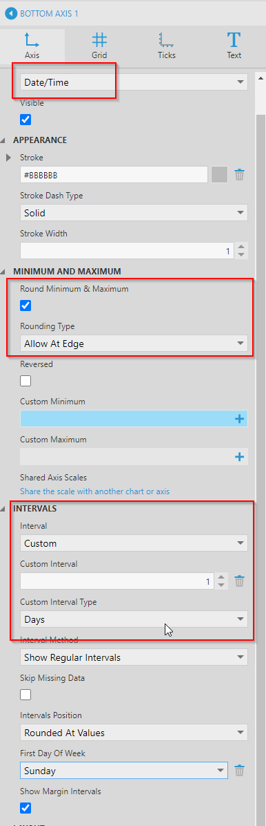
I’m showing data that starts and stop in a single day, but want to have the x axis show an entire 24 hour period.

I want the axis at the bottom to run from 12am through 11:59pm.

This is a Range Bar visualization, and the gray bar is created using the timeIn and timeOut dimensions. The Date dimension is at the “Day” level and is being used as a date filter. I don’t currently have an “Hour” level available to me for the Date dimension. Would that enable me to get a 24 hour x axis?

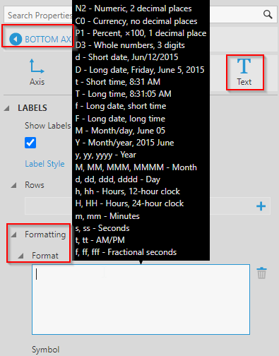
I read here about handling missing data, but I didn’t see how that applied in this case: https://www.dundas.com/support/learning/documentation/analyze-data/handling-null-data-points

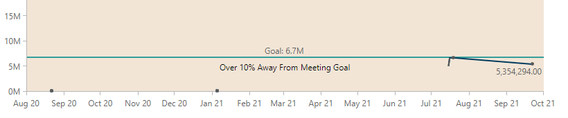
I don’t currently have any measures in the metric set, nor do I think I have a need for one. I’ve tried adding the available measures but didn’t make progress that way.

Thanks!

Hi Thomas,

One way to achieve this, is through the following steps:

Open Data Analysis Panel of your chart -> Visualization -> Axis -> Remove all existing dimensions from ‘Bottom Axis Label’ (or you can create a new Horizontal Axis on the properties panel of the chart)

Open properties panel -> Bottom Axis 1 -> set the following properties as below:

Scale Type = Date/Time
Under Minimum and Maximum section:
Enable Round Minimum and Maximum
Rounding Type: All at Edge (if you don’t want to round down if a data point starts at midnight)

Under Intervals Section set:
Interval: Custom
Custom Interval: 1
Custom Interval Type : Days

In the Text tab of the Bottom Axis, you can change the intervals for the labels to 1 Hour, as you would want to show all 24 hours labels in a day
So, under Intervals Section set:
Interval: Custom,
Custom Interval: 1
Custom Interval Type : Hours
(There are similar intervals settings for Grid lines and Tick marks in the other tabs if needed.)

As the last step, you may set the axis labels Formatting as desired from the Text tab -> Formatting -> Format

2 Likes

Perfect! Many thanks!

1 Like

I have a similar issue where I want there to be a tick mark with a label for every month…how can I set this? Sometimes it shows the way I want, but other times it does things like this:

With that metric set, returning to the dashboard fixed it:

but on the same metric set filtered to a different facility, it remained with brackets in the dashboard:
image

I figured it out! Within the bottom axis text menu, clicking on the dimension again brings up a menu where unchecking “show as groupings” changes the brackets.


image

(There is at least one other place where this show as groupings option appears but has no effect)

3 Likes