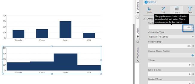
I currently have this chart in Dundas BI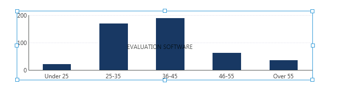
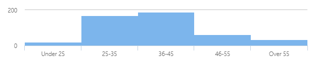
Do you know how I might be able to achieve a look and feel, such as below?
I currently have this chart in Dundas BI
Do you know how I might be able to achieve a look and feel, such as below?
In this case, you can set the chart series’ “Cluster Gap” property to 0 and that should do the trick: