What I want
A radar chart displaying a count per day of the week/hour, with both the day of the week and the hour in the chart.
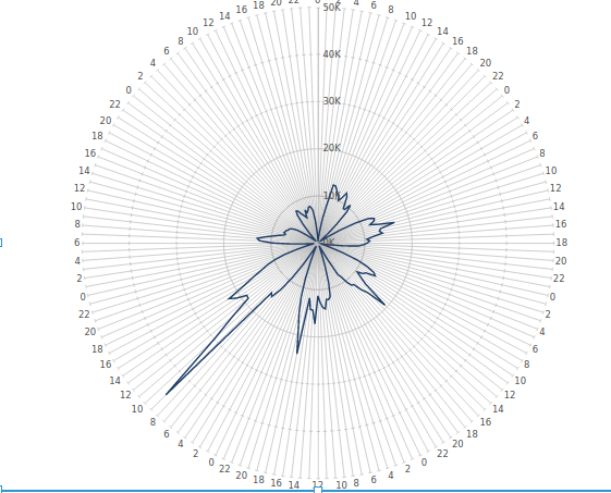
What I get
A radar chart displaying either the aggregated count per day, or each point per hour (what I want) but the day name does not appear in the chart:
What I have
- One hierarchy with 2 levels:
a. dow which is a number (1 to 7) with as caption the actual name (Monday to Sunday)
b. dowhour containing a ‘unique id’ (100 * dow + hour), with the actual hour as caption - One data cube, giving out 3 columns
a. dow (promoted hierarchy, matches the top level)
b. dowhour (promoted hierarchy, matches the 2nd level)
c. count (my actual data)
My final question
How can I get both levels of the hierarchy, thus hour and day on my radar chart?
Cheers,