Greetings,
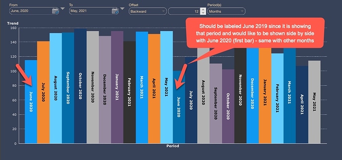
Have a simple question that may have been discussed before so my apologies in advance for asking again :)…(actually had a ticket on this from February 2019 but this question came up. again for us). I am using PoP analysis (OFFSET filter functionality) that is built in Dundas (version 7.0.2) but our users want to see the LABELS on the graph (see attached - first screenshot). Currently, all I can show for PoP for last 12 months on the graph is Current Period and Previous Period for either Series or Legend LABELS. So for example if I am doing June 2020 - May 2021 for Current Year that date range will show on my X-axis and SERIES/LEGEND LABELS will show Current Period and Previous Period (technically that would be then June 2019 - May 202) if we reference example provided). So our users want couple of things (and they are sticking hard by that request :)):
- Labels showing what we are comparing (YoY, MoM, QoQ - based what we select in OFFSET filter) AND/OR
- Showing (referencing this example) current month and previous month SIDE-BY-SIDE (so June 2020 and June 2019 bars would be next to each other) - maybe somehow in screenshot #2 I attached which is NOT using built in OFFSET filter. Third screenshot shows that this is possible in Excel and I believe in SSRS as well.
I was thinking maybe a potential solution IF we continue using OFFSET filter v. say 2 Calendar Range selections could just be adding a ‘dynamic label’ on top showing what is Current Period and what is the Period that Current Period is being compared to (i.e. Previous Year in this example), however, I think that I’d need it to be DYNAMIC (i.e. if say LAST 4 Quarters is selected in OFFSET menu or LAST 90 Days, etc.)? So thinking in my example 2020 and 2019 would be sufficient as LEGEND LABELS? If this suggestion could work, would appreciate any info on scripting this out somehow.
Hope I am not being confusing here.
Thank you!


