Percentile on Axis-x

Hi Community,

I was requested to develop the below chart.
Axis-x represent the percent 5%,10%,15%....95% (19 bars in total on axis-x)
Bar in each percentil will show total volume for the measure

Line will show the exact percentile
How should i prepare my row data on cube and whoch visualization in the most sutible for that ? (DB connector is Vertica DB)


see the image below (ignore the numbers on the x-axis and the nuber of bars it is just for ilustration)

hope i was clear enought :)


Thanks In Advace

reversered Pareto? then add to it for the volume maybe a start.


Might be good to know what the Pareto is doing so you can change it. I think right click on the perecnt bar and change order from desc to asc.


I woudl start off messing aorund with the Pareto and then work from there. because except for the order and the volume measurre you have Pareto elements.

I agree with James that this looks like a variation of a Pareto chart, but I am not clear about what data you are getting.


Do you have the percent and percentile values or are you having to calculate them also?


I don't think you need to do a Pareto chart necessarily, you could just have multiple measures in the chart. Each measure can be formatted differently under chart properties. You can click on a measure and select chart type of Line even though the rest are bars.


I do not know what data you are getting and what calculations you need to do, but the following might help.


If you have percentile values and want to group them into buckets for the blue bars, I would create a calculated element in the data cube.


To get your gray bars you could add a formula measure using CMLTOTAL ( https://www.dundas.com/Support/learning/documentation/design-view/formulas/standard/cumulative-total) on a count of cases.


You might also want to investigate the PERCENTILE formula (https://www.dundas.com/Support/learning/documentation/design-view/formulas/statistical/percentile)


Hello Sachar,

I just finished building a chart same as your requirements. PERCENTILE function in dundas retreive one value each time on the dashboard so you need to use in the data cube to get your result:


I will try to describe my solution as much as I can.


1. create new data cube and drag the table that contains your measure , if you have multiple columns then be sure just to check the measure and deselect other columns.


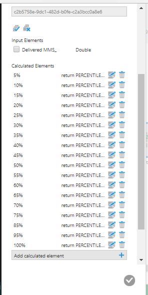
2. add calculated measure transformation and create 19 calculated measue as below

Name: 5%, 10%, 15%, 20%, .....,95%,100%.

Type: Double

Expression: return PERCENTILE($Delivered MMS_$,5,"TRUE"), return PERCENTILE($Delivered MMS_$,10,"TRUE"),return PERCENTILE($Delivered MMS_$,15,"TRUE"), .... return PERCENTILE($Delivered MMS_$,100,"TRUE").

See below example for 5%:


and this the calculated measure transformation snapshot:

3. Be sure to deselect your original measure as you don't need it any more.

4. add "Remove Duplicates" Transformation Next. Final result will be:


5. Add UnPivot Transformation Now,and configure it as below:

Final Result Now will be:

Image title

6. Add Calcuated Measure, and create new measure with following configuration:

Main reason, that you need the value of the percent to be double so you can use it on the chart.


So now final result of this datacube is:


On the chart, you just drop Volum as BarChart, Percentage as Line chart, Percentile % as row. Put the percentage on right access and keep volume on left access, and sort your chart by volume ascending.


I cannot say that this the optimal solution, but this is only solution that comes in my mind.