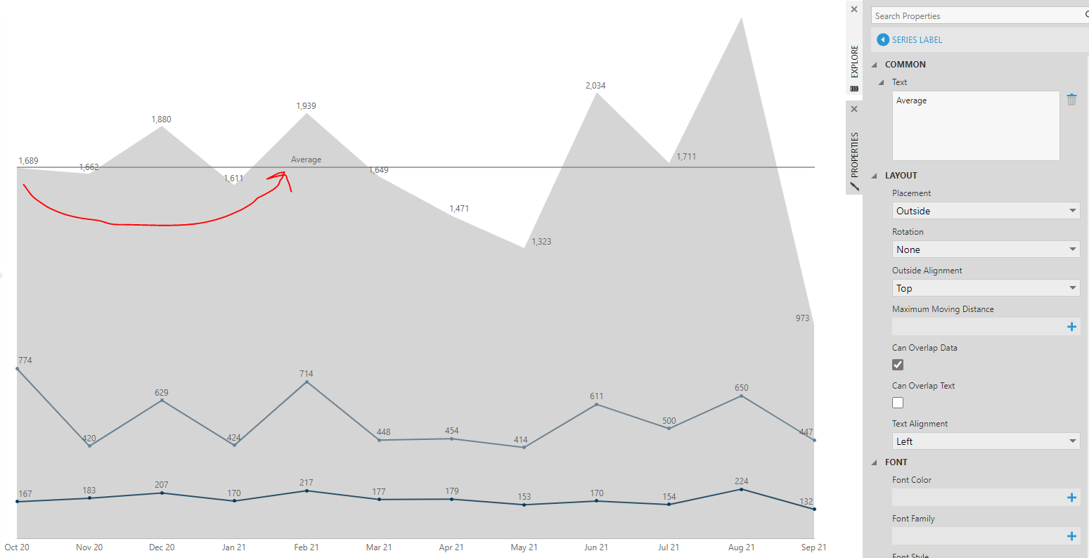
However, I am unable to get the word “Average” to display on the line. In the series label properties, it shows up by default in the center of the graph, which is hard to find. If I move it to the left or right it disappears, even when allowing to overlap data. How can I get “Average” to display as the series label?
An Outside Alignment set to Left will try to place it along the left side of the entire line, where there is no space because this kind of line always stretches across the entire plotting area. This scenario seems to be making the case for additional outside alignment choices.
One way to put a label there would be plotting another data point along the average line just at the first X axis value (Sep '20). For example a formula measure if ($Measure$ == FIRST($Measure$)) return $Average$, or to be safer in case a measure value reoccurs you can turn the date into a measure first using a method like $Date$.MemberTime.ToBinary(), then if ($Date Measure$ == FIRST($Date Measure$)) return $Average$. There would be just one data point (as a marker) for the series displaying this measure with a series label in the right place, and you could set its Marker Shape to None if preferred.
Thank you! Additional alignment choices would be great, should I submit that as a feature request?
Finally had a chance to try implementing this. It initially creates two labels–not sure why, but playing around with it, I was able to get the bottom one to disappear.
Another update: the label disappeared when the metric set was added to a dashboard. Tried adding it as a series label instead and found that it only appears if I leave the rotation open to auto-switching even though it doesn’t rotate:
It seems to work more consistently than the data labels though, where I’d switch it to “outside” and have the label disappear, then change it back to “outside or inside” but the label would not reappear. Not sure why.
ETA: I can get it to change if I set it to overlap text, but of course I don’t actually want it to do that, is there a way to get it to display above or below the line? I can’t find a way to get it to show right below the line. Alternatively having a way to get a background behind the text would help if it had to stay in place but overlap, which is also in the dashboard I’m trying to replicate:
I noticed that the way this was set up originally in Tableau, the line extends slightly beyond the plotting area of the area chart to the left so there is more space for the label. I tried to mimic that in Dundas by unchecking the round minimum and maximum, but it’s showing an extra month with no data at the ends, which is misleading.
If labels are appearing where you don’t expect them, you could click directly on the label itself while editing to open its properties in the Properties window, and clear the Text property for example for an unwanted one or just check if it’s a series label or data point label and click the back button to see what data point series it is.
If labels are being positioned where they conflict and are being constrained by the edge of the plotting area, changing settings around such as Rotation or Placement can affect the priority of which labels are plotted first, potentially crowding out others, because data point labels always must be directly adjacent to their data points (labels don’t have leader lines except in pie charts or if data is assigned under Note in the Data Analysis Panel > Visualization).
It looks like the example you were emulating has additional space to the left of the first data point to work with. It’s perfectly fine if you prefer not to show additional months at the ends of the axis if they appear when checking Round Minimum & Maximum: there are a set of properties under Layout if you scroll down the axis properties that allow you set up a Minimum Margin in enough pixels to fit a label for example. (It’s not quite misleading though to display additional months because this is a time axis showing the continuous progression of time between a start date and end date, with axis labels shown for reference purposes even if data points are missing anywhere along it or not present at the ends. This is like a numeric Y/vertical axis, which labels values for reference purposes whether there are data points with exact matching values are not.)
If you got the label “Average” to appear for a single data point on the left, setting Outside Alignment to Bottom should be displaying it below that average point & the average line unless there is some other data or label in the way if the Can Overlap Data/Text options are unchecked based on a similar example I am looking at.
The two labels appeared when adding a data label even though there is one point of data. Clearing the text property gets rid of them both. I switched to using a series label instead. However, the series label will display in the middle of the chart just like the second data label if I change the outside alignment to left. I’m not sure why, since there is no data for the FIRST average there.
There is much more data behind this chart, but it’s filtered to a rolling year, so having the extra axis labels is misleading because they show as having no data when actually there is data for that point in time.
Interesting, changing the Outside Alignment to bottom for me just makes the label disappear entirely. I’m not sure why, since it’s set to be able to overlap data and in metric set view, there is plenty of space and no text under the line.
If that works in other circumstances, it would be great if this could be toggled like the others so it would usually be above but would toggle to below when there’s something else above the line. Failing that, having the ability to set the text background color or make the data labels on the chart below not show in cases of overlap instead of the Average text would be helpful. Currently, if I change the filtered date range from Sept to Oct, the Average label on if ($Date Measure$ == FIRST($Date Measure$)) return $Average Number Cards$ moves to February, which isn’t helpful:
Thank you for describing that context, yes I can see how you might not want to show the end labels. You can disable them but still add other margins, and I think you should do this before trying to place the label under the line. We don’t have semi-transparent backgrounds behind our labels because they are designed to avoid overlap instead, but they do need the space for this.
I think you should check on what series this is by clicking to navigate back in the Properties window, and exactly what all the values are in the measures used for that series in the Data Preview window. A label can’t appear in the middle of the chart when placed outside unless there is a data point somewhere directly adjacent to it.
I had not seen this kind of result from the FIRST function before but with monthly data I now can, and I entered a ticket #90144 for someone on the data team to look into it. I also entered your use case for a feature request that can probably be solved much more easily with some new outside alignment choices. But since you created a measure based on the dates themselves, so the “first” date on this chart is also going to be the smallest, we should just swap that out for BOTTOM in the formula.
It’s a bit difficult to follow all of the steps you’ve taken and the rest of the setup of your chart in this forum, so you may want to try reaching out to support to go over some of the details if it’s still not working out after adding margins.
I checked the Properties. It is the series for the (now, updated) BOTTOM() formula. Looking in the Data Preview window, the only rows for that are for the first month and the grand total., which have the same number.