Hi,
We've just come across a challenge with our efforts to make sure our dashboards are translated into the appropriate language for our users and we'd appreciate some input.
We have a lot of charts that display information by month. In English this is all fine, and we generally use the three-letter abbreviations for the months, drawn from a datetime (or time dimension) in our datacube. However, we're not at all sure how to go about translating these abbreviations for other languages. Obviously French and Spanish and other languages don't use the same abbreviations because the names of the months are different.
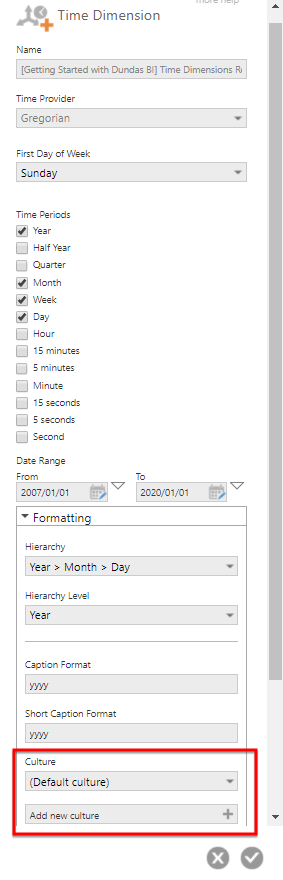
Is there a sensible way to inform a visualisation of which culture it should use when generating a string representation of a month name from a datetime? For example, given '2018-01-30', we would get 'Jan' in English. In Spanish, we would probably want 'Enero', or something similar. In Chinese it would be something else altogether. Imagine a bar chart with months across the x-axis. How do you get the month names that you display there to be in French, or Chinese, or Klingon?
We are already passing in the current user's locale as a view parameter, so we have something to base it on, we're just not clear on whether it's possible to make this work, and how to go about it if it is.
Adam