Light or Dark Mode - which side are you on?

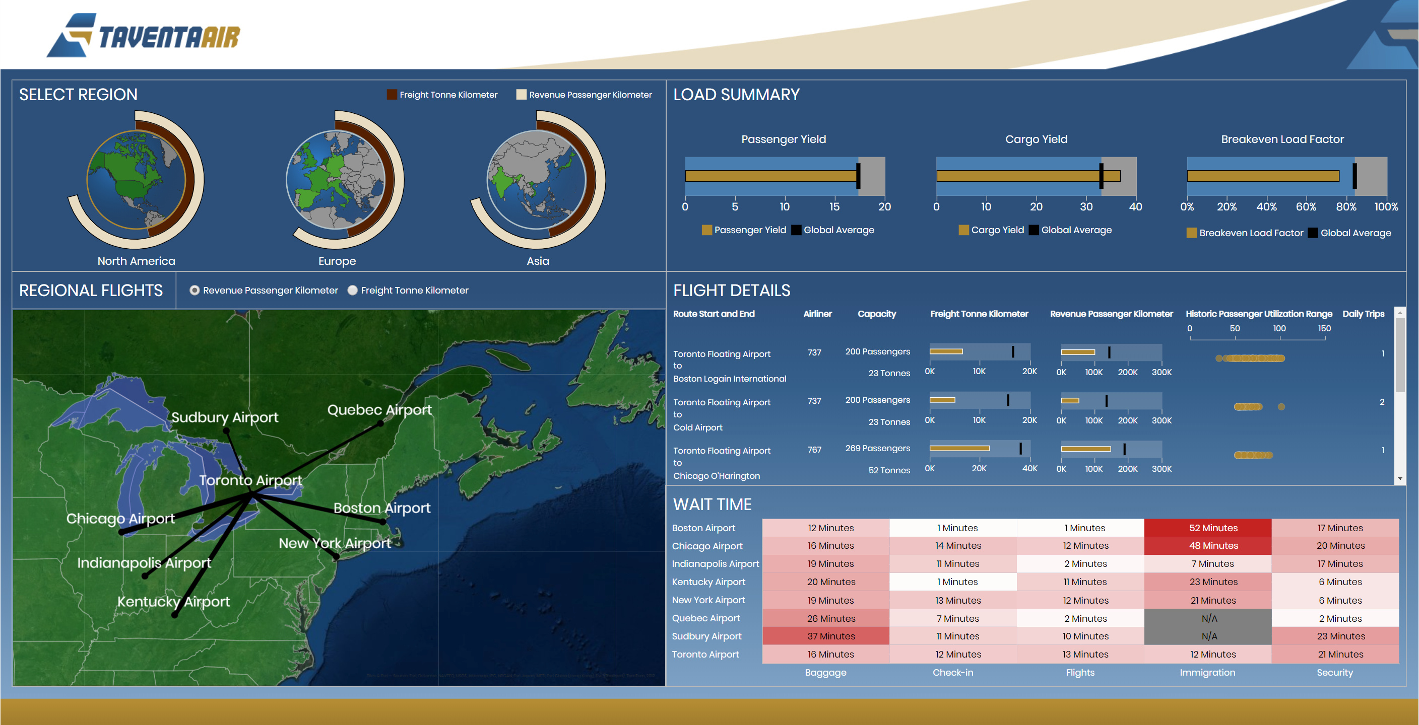
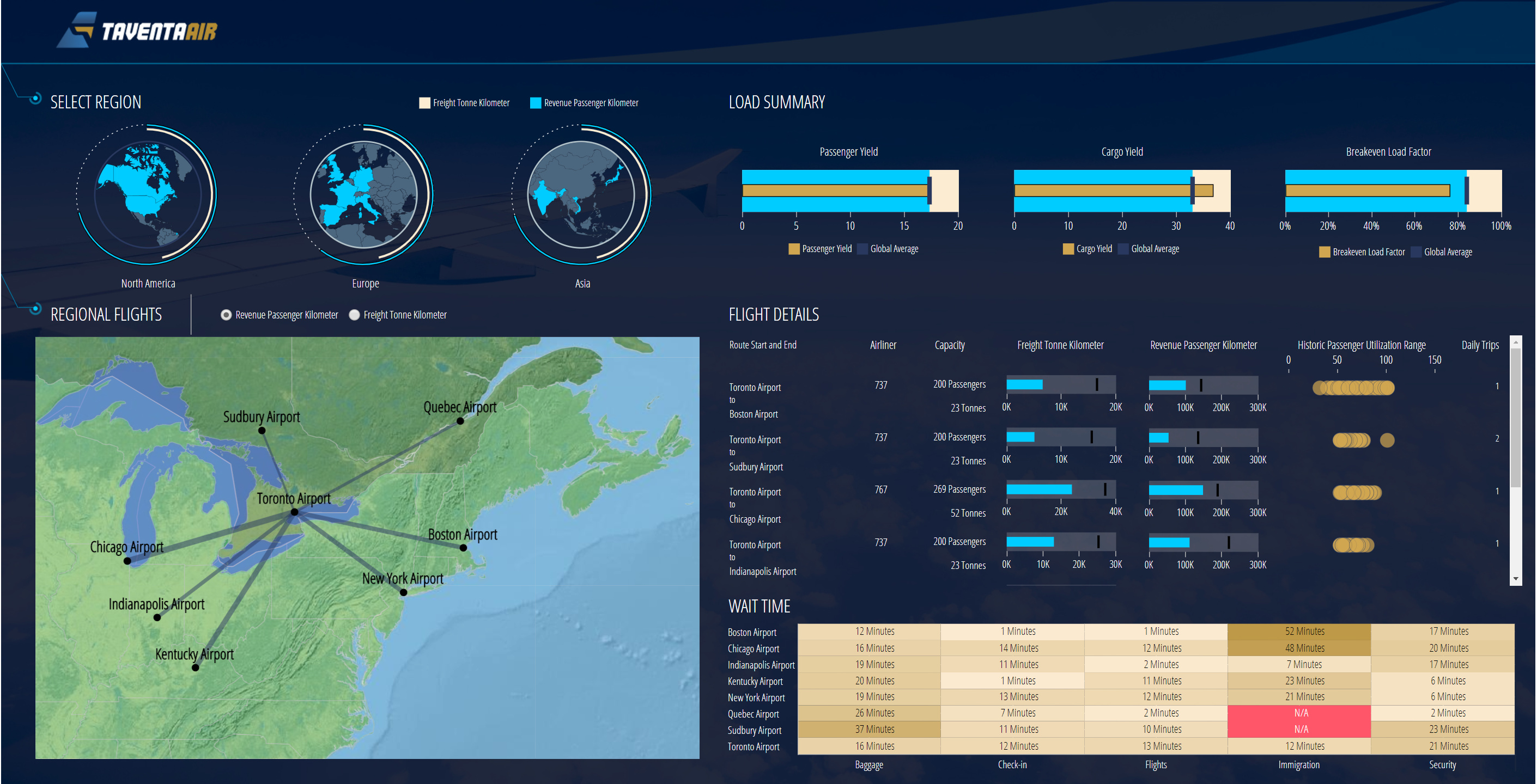
In a battle of Light and Dark Mode - which side are you on?

Do you gravitate to one mode over the other? Do you use both? Do you use one mode for certain projects?

Share your thoughts - and samples if you want

Yesterday, Jeff asked our forum users in a different post which of his sample dashboards below they preferred. This got us thinking this Light mode vs. Dark could be an interesting debate.

Dark Mode tendencies but it also depends.

I do have a question on these two choices, why is the map flip flopped? it looks like to me that the light mode has the dark map and the dark mode has a the light map.

Part of me would like to give a reason about how you want to have contrast or complimentary colours
for maximum aesthetics. In this case, it ended up that way due to dumb luck.

By the way, I’m a fan of the first one. The designer gets a vote too, right?

I generally prefer Dark Mode but for Client or business purposes, definitely brighter ones. Cuz, there are rules, no?

I have become more of a fan of dark mode ever since I started using PyCharm. It is way better for my eyes I feel. This is just my personal preferences though, most of our business dashboards are still using light mode.

I like light mode because I find dark mode strains my eyes, especially in dimly lit rooms.
That said, I do prefer dark mode on twitter.

I prefer A, just because it’s easy to read!

Though I found the option B very modern A looks easier to ready, so I would go with option A.

Light mode for monitors, dark mode for projector content.

I agree with Jacob. I think I might just put in a “Projector Mode” switch into my dashboards to let the user dynamically switch to an appropriate visualization mode… I feel a project coming on…LOL

1 Like

In text heavy dashboards I prefer dark mode. However, i think light mode looks cleaner for presentation of visuals.

For dashboards I prefer light mode. Looks much cleaner and text stands out better. On my phone and PC, however, I usually prefer dark mode for less eye strain.

I love the darker screens as they appear more modern to me. I like to be able to pick the screen out easily out of a bunch that are open. However, I noticed that many designers either go too dark or the font used is too thin. A font with serif is thinner and is harder on my eyes. Plus, there has to be a strong contrast between the light font and dark background or vise versa due to ADA requirements. I think the courier font or Times Roman are old school and prefer the more modern fonts too.

Dark Mode because it is elegant and saves power

Dark mode all the way. I find them much easier to read at a distance (and 90% of my work goes on wallboards around the office)

i generally prefer dark one

Dark mode, much easier on my eyes.

Dark mode for me works well most of the time but sometimes light mode is appropriate.

I prefer the dark mode as well. I find it easier on my eyes in bright or dark environment.