Hi there Sandi!
This visualization in the boxes on the left side of each goal, is actually comprised of a few different visualizations that are then grouped together on the Dashboard.
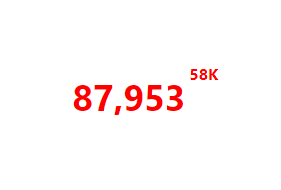
Firstly the Lager number as well as the smaller number in the top right corner of the box, are both Data Label Visualizations. Data Labels, as their name suggests, visualize data point values within a label.
You can create your Data Label by dragging and dropping your necessary measures and dimensions onto your Metric Set, and then selecting Re-Visualize->Data Label from the Toolbar going along the top of the page.
 You can the adjust the properties of your Data Label to get it looking just as you would like.
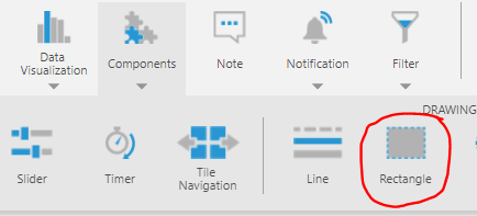
Once you have created your two data lables, you can add a Rectangle Component to your Dashboard to represent your "box". You can add this by selecting Components->Rectangle from the Toolbar at the top of the page.
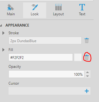
You can then edit the properties of the rectangle, deleting the defualt colour value it has, so all the remains is just the outlining boarder. Once you have done this, you can re-size and re-position you box to fit around your two data labels.
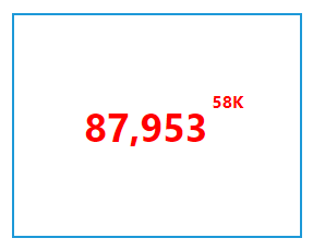
You can continue to add any additional visualizations to you box, similar to how the sample also includes the spark line within it.
I hope this helps answer your question!


