How Evergreen Health Embraced A Data-Driven Culture And Substantially Reduced Time Spent Reporting

Hot off the press! We have a phenomenal success story to share with you today, featuring Evergreen Health and Dundas Community VIP @jacob.perrello! This story is not to be missed - you gotta trust me!

In this story, we dive into how Evergreen Health wanted the freedom to work with their data how they wanted to, when they wanted to. They weren’t willing to compromise when it came to their analytics and refused the restrictions other business intelligence platforms imposed upon them. By choosing Dundas BI, Evergreen stepped free from the constraints of Excel and realized their dream of becoming a data-driven organization.

As a result, they’ve been able to slash their time spent reporting exponentially, deliver real-time, custom insights across the organization, and improve the quality of care delivered to their patients.

Jacob Perrello is the Director of Analytics at Evergreen Health (and one heck of a great guy to boot!).

Click HERE to read the case study >>>

After checking out the success story, feel free to leave any questions or comments for Jacob below!

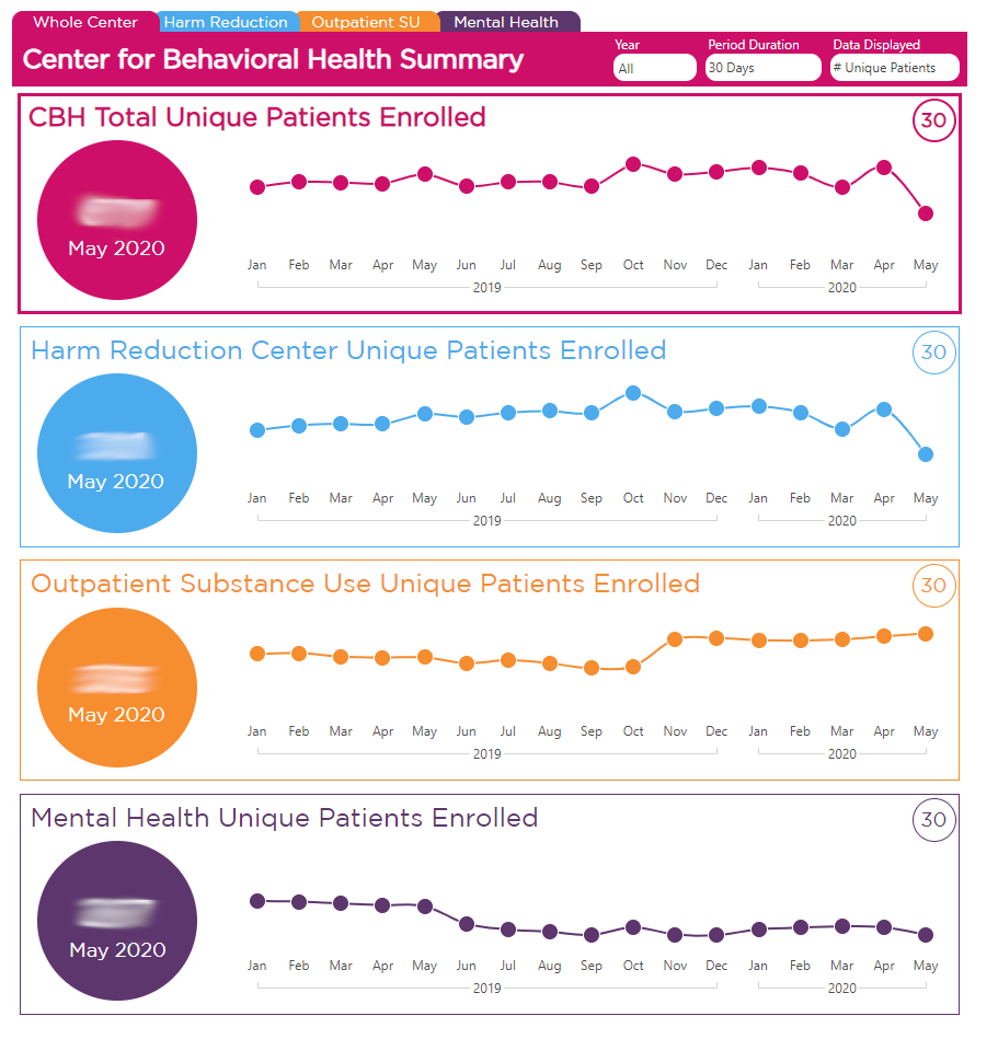
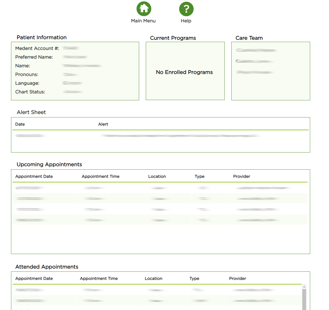
And take a look at these screen shots of Evergreen’s incredible solution - I mean… wow!

Amazing case study and nice visualaization

Great case study! I really appreciate it.

Fantastic job.
Dundas’ flexiblity plus Evergreen’s imagination, skill and hard work have produced something a lot more than just a BI report - it sounds like many systems rolled into one.

My question is how users were persuaded to go online, and if people are still asking for Excel and PPT files.

I really like the colors used and think it is great that there is overall data available, but you can also drive it down to specific patient information. Gives people a lot of information and the ability to view it in different ways.

It is a very interesting scenario!

Excellent. Love the ease of the menu navigation.

Great stuff!!! I just thought I’d point out that if anyone is looking for a nice menu system in their dashboards that I created a video for this.

Enhance your BI User Experience Using Custom Menu Navigation Controls:

I like the look and feel of the visuals. Will take some inspirations for sure!

A great example of Dundas BI’s visualization power!

Nice work! I love the clean design with the focus on information insights! Well done.

The dashboard looks amazing.

I appreciate this case study as this type of reporting is relevant to my organization.

Truly a beautiful dashboard. You were able to tell the trends story visually. This is a great case study that I’ve shared internally with others in our organization.

This kind of reporting would be really useful for what we do!

Amazing charts and great data structure layout .

Great case study! The dashboard looks amazing