How E-Tabs Partnered with Dundas to Create Highly Engaging, Customized Reporting Experiences

We’re excited to share with you, the story of E-Tabs and Cube VIP, @david.glickman - This is one story you certainly DO NOT want to miss; it’s a real page turner :open_book:

With this case study, we dive into how the combination of Dundas BI and E-Tabs’ data visualization experts were able to create highly engaging, customized reporting experiences their customers love. With Dundas BI, E-Tabs has transformed the way market research insights are viewed, and have empowered their their customers to truly take advantage of their data.

David Glickman is a Senior Dashboard Implementation Consultant at E-Tabs

Click HERE to read the case study

After checking out the case study, feel free to leave any questions or comments for David!

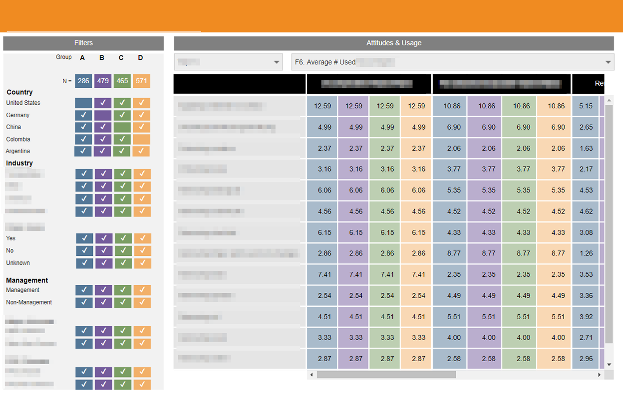
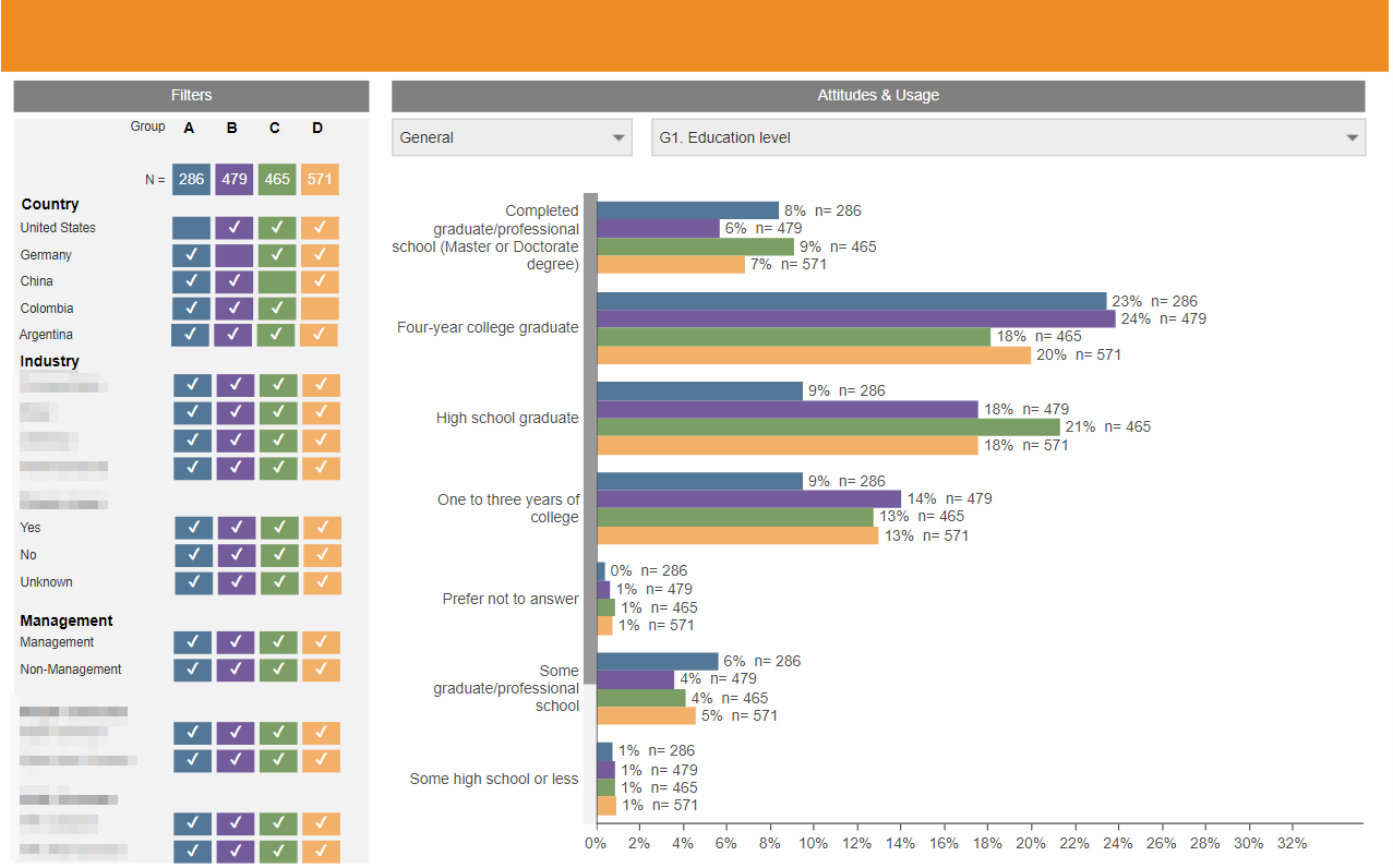
And take a look at these screen shots of E-Tabs’ amazing solution:

2 Likes

Looking good @david.glickman !

Indeed it is @jeff.

Thanks for your hard work on this, exciting stuff!

I am just replying to get the 60 points. Just kidding! :laughing:

This is some really great work, and I know that there a lot of extra neat stuff under the hood Because David is a JavaScript guru.

1 Like

Very good case study - thanks for sharing!

Thanks for sharing. Hopefully, will be able to pick some tricks for my own solutions.

Nice and appealing aspect. Good work @david.glickman

Great Work David and Jeff!!!

Good one! thanks for sharing!

looks pretty good. Using reporting almost like a website

Some really great ideas in there! Thanks for sharing with us!

Well done sir. Keep it up!

Very nice. I’m digging those dashboards, keep up the great work!

Very nice , like magic

Very cool, custom looks.

Thank you for the design inspiration!

Honestly, this was really cool to see. Great inspiration.

Thanks for sharing! Really useful!

I love thi solution and the colors and layout of your “Attitudes & usage” dashboard making a table visualization stand out and fun to look at (we use lots of tables! So this is very inspirational for me) ! I am also drawn to the color palette / choices you made for the alaskan pollock dashboard.

I’m curious if for the “tabs” you used javascript / css to style those or created / used custom images?

I’ve been thinking about what route makes most sense to go in instances of that kind of thing here.

Thanks!

nice case study, thank you