Have a legend *always* going from 0 to 100

I have a line graph, pretty basic, displaying percentages, guaranteed to be between 0 and 100.
The actual data will only cover a subset of this (eg. from 10% to 40%) but I want the legend on the left to have a marker from 0 to 100, not only from 10 to 40 in my example.

For instance, while the dashboard is loading I see this (left axis is of interest here):

But once the data is in, I see:


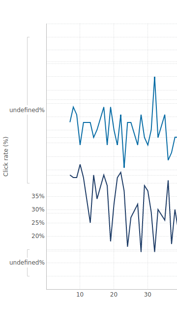
where there are only legend points from 20 to 35, whereas I would still want to see 0% to 100%.

This is how I configured my axis:

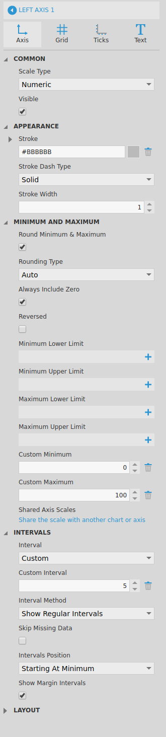
With my custom minimum, custom maximum, custom offset and ‘show margin interval’, I expected to nicely see from 0 to 100 in the left axis.

Is there a way to achieve what I want to do?

On a side note, when looking at intervals for an axis, I can set them up in the ‘axis’, ‘grid’ or ‘text’ tab. I have no idea which one wins and I find it quite confusing :slight_smile:

I think it is the minimum Upper Limit.

I too wish they called these setting something different and had a better tool tip than “set value for this property”.

I know I have done this but still looking to find on what dashboard I did it on. brb

I just made some fake data,
it is not min upper limit.
I got it to work with “Custom Maximum”.

One thing I did is my percent is a double and then at the data cube it is set to format P2 (percent with two decimals) and my value for “Custom Maximum” is 1 (1 = 100% in decimal).

What is you bottom Axis? mine was a dimension not another measure percentage.

Thanks for trying James!

I do have custom maximum to 100 already (and a custom min to 0). My percentages already come as int from the data cube, so format is N0 with a symbol after. I see that the min/max do take effect, because my axis is longer than if I do not set that up. But there is no left labels if there is no data.

My bottom axis is a dimension, which coincidentally is a actually percentage (eg. int from 0 to 100) as well. I set it up as numeric. But now that you mention it, I have the same issue with my bottom axis: no data means no label. It is less visible because my bottom series is usually more spread out, but the issue is still there.

I think the problem is not in the axis settings.
do you have two left axis? in the data analysis panel “Visual”, then Axis, What is all set for bottom and left labels?

I ask because looking at it closer it does look like ti is going to 100% but there some undefined measure in there along with the measure that is your percentage.

see what happens when copy the data cube and get it down to just the one measure and one dimension.

Yes! Thanks! It is not intuitive but I got it:

  1. As you said, go to graph property > left axis > click on the label (there are multiple paths to reach this place, the one you gave works as well)
  2. uncheck ‘show as grouping’. All undefined values (not present in the data) were actually grouped together. ‘show regular interval’ must be set as well, but it was already the case and that one feels logical.
  3. In the same place (or one level higher, on the left axis definition), explicitly give a format (N0 for me)
  4. Optionally add the symbol % (my data comes as int, not as a P format)
  5. profit!

And of course, the same applies to my bottom axis and right axis.

To answer your questions, I had 1 left and one right axis. The left one (with percentages) did go to 100% but did not display the values.

Thanks a lot for your help, I can start my weekend with a clear mind :slight_smile:

Glad I was able to help.

Hi - Sorry I’m jumping in a bit late, but the original chart’s left axis is not a typical one, and it sounds to me like you have data assigned under Left Axis Label in the Data Analysis Panel in the Visualization tab like James was thinking. This is unusual and not a default setting because a typical numeric axis does not directly display values from your data at all but just rounded values it comes up with itself at a regular interval for reference (your data may not contain the exact values 25%, 30%, or 35%, for example.) You could remove this from Left Axis Label and not deal with the axis “Rows” properties you mentioned.

All properties always have a proper description you can access by hovering over the property name, even if there is a big “+” button below it because it’s currently un-set - in which case the tooltip is describing the + button and not the property. Minimum Upper Limit’s description is “The highest value that can be calculated as the minimum”, which means the axis can’t start at any higher value than this, like if you wanted it to start at -100% but go lower if your data goes lower. We may have to think of ways to ensure you can find these when you don’t already know they’re there.

Hi Jamie, you are right, I had data assigned to the left axis. Removing it still works, and led thus to a simplify setup. I like that, so thanks a lot.