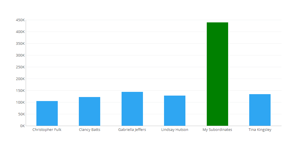
You can dynamically group the different categories you see on your visualizations when viewing a dashboard. This self-service feature can be beneficial for custom analysis as an individual viewing a dashboard might not have access to edit mode to make such changes. Check it out.
If you’d like to learn more, I’d recommend you go to my learning channel - Off the Charts (with Jeff).
https://www.dundas.com/resources/off-the-charts-tips-from-an-expert


