Grouping data and presenting with state indicators? Multiple indicators?

I’m trying to reproduce this display:

image

I’ve decided that the categories and overall score (on the left) can be done separately and added when I build the dashboard.

What I’m having trouble with is reproducing the data representation on the right. The intent is to have a box showing the number of audits that received a 100% score, with blue for the box, and a second box showing the audits that got less than 100% with their average score and the number of audits in a gray box.

I’ve been able to produce a single box for each day (I assume I can group later by week):

image

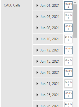
However, some of these days have 100% audits as well as <100% audits, so I want to show two boxes.

Is there a way to break these out? Create a 100% column and a <100% column?

Thanks!

Hi, you should be able to do this in a couple of different ways depending on the structure of your data and the way the calculations were done:

  1. Calculating <100 and >100 separately in the cube level or pivoting your data is an option you can explore. That will give you row-to-column feature

  2. If you have a separate dimension called status with greater-than-100 and less-than-100 as string values (Closed and Open in my case), you can use that under COLUMNS in data analysis panel to split the measure into two columns, and then apply states based on the status values, something like below. Here I put the header text of my measure WorkItemID to empty string and applied states:

  3. If the visualization is meant to be static and there won’t be any drilling up/down by the user, you can simply copy the same table (metric set) on the dashboard. Next, filter one metric set to show just >100 and the other one <100. Place them side by side with different z-index values so that one table is above another and the >100 and <100 columns are visible in the way you want. Here, the closed and open columns you see are my measure column with edited header texts. The data analysis panel simply looks like as in the second screenshot:
    image


    Hope this helps!

Upasana,

Great reply, thank! I love asking a question and getting three different ways to solve it in reply. :slight_smile:

I’m going to go with the third option, which also occurred to me while I was out on a walk this morning. I like that it lets me solve the problem without having to change the data cube.

Follow up question - won’t filtering out the <100% on the first metric set cause the days on which there are only <100% results to disappear? How do I keep the rows the same on both metric sets, so that the first (top) metric set shows all of the dates and the second (behind) metric set also shows all of the dates? My concern is that the rows won’t necessarily be the same for the two metric sets.

For example - I filtered to show just the 100% results (of $AVG score Expresssion$) and had 25 rows (days), but filtering to show only the <100% results gave me 10 days. I tried adding “count of $unitEntryDate$” as a measure thinking that it would somehow force the date rows to appear, but Dundas doesn’t allow me to both use $unitEntryDate$ as as a row and count of $unitEntryDate$ as a measure.

image

So I think the question is: How do I force the metric set to show all rows (days), while not showing the $AVG score Expresssion$ results on days when the results are <100% (for the “top” metric set) or =100% (for the “bottom” metric set)?

I’m playing around with formula options. I’m coming from the Tableau world, where a calculation like this would work to give me what I want:
image

Dundas doesn’t recognize it as a legitimate formula. What I’m trying to do is to look at each audit that falls on a particular day (determined by the row in the metric set), and only average together the scores of those audits that were less than 100%. Then I could do the same for the 100% scores and display the result in a separate column. I think this would let me display the data using a single metric set, with two columns of “boxes”, one for the 100% results and one for the <100% results.

Does Dundas have a formula that would do this? Can my formula be made to work?

Success!

I ended up creating two new functions to calculate the % of scores (just including the 100% or the less than 100%) and two functions to count the # of audits (just the 100% audits or just the <100% audits).

Just 100% scores:

if (AVG($score$/$possible$,$auditId$)>=1)
{
return (AVG($score$/$possible$,$auditId$));
}else
{
return;
}

100% count:

if ($AVG score Expression$>=1)
{
return 1;}else
{
return 0;}

Then I could build this, using “Column type, State indicators”

Finally, I have a display showing the scores and count for just the 100% audits and scores/counts for audits less than 100%

image

Thanks everyone for your help!

1 Like