Display values selected from a Dynamic element filter on the report

Hi,


I have a Dynamic element filter that I have created using three fields 'A', 'B' , 'C'. I have created the X axis of my graph using the Dynamic element. So when user selects 'A' from the Drop down, my X axis title should show 'A'. Similiarly when 'B' is selected from the prompts B should be shown. Is there any axis property that will help me to do this.


Regard's,

Sam

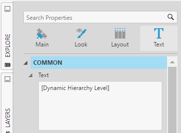
The property you are looking for is in the Text tab of the Axis properties.

Image title


However, this property takes only static text. You will have to use a script to change it based on the dynamic element.

As an example, you can add the following script to the Parameter Value Changed action of the Dynamic Element Filter.


In this script, the unique name of the item selected in the filter will be set as the X axis title. However, you can use the commented part to set your own custom text based on what is selected.


// Returns a view parameter with matching name

var baseViewService = this.getService("BaseViewService");

var myParameter = baseViewService.currentView.control.viewParameters.filter(function(item) {

return item.name === "viewParameter1";

})[0];

// Set the bottom axis title to the unique name of the item selected in dynamic element filter

chart1.control.xAxes[0].title = myParameter.parameterValue.uniqueName;

// You may define your own custom text for each case, the commented part below is just a sample

/*

if (myParameter.parameterValue.uniqueName=="ProductID") {

chart1.control.xAxes[0].title = "Custom Title Name"

}

else {

chart1.control.xAxes[0].title = "";

}

*/

Thanks, this is exactly what I was looking for.


Regard's,

Sam

Another way to solve this (without script) is to use a data label control to reflect the currently selected element (i.e. field) for the axis. This can be easily done by adding a data label, connecting it to the same drop down filter for the dynamic element and setting the data label Text property to use the dynamic element placeholder - in this case: [Dynamic Hierarchy Level]

Image title

This solution will avoid the script but you will need to be careful to leave enough room between the data label and axis as the axis allocated space may change based on the selection.

Thankyou..It works!!

The above works for Dynamic element.


I have a multi select Country filter and I would like to display the countries I have selected from the filter on the dashboard. If I select 'US' and 'Canada' , I would like to have them displayed as a line item on my dashboard.


Regard's

Sam


You can do this using a table visualization. For example, create a table visualization and drag the 'Country' field onto the "Columns" section of the data analysis panel of that table. Then connect the 'Country' filter to the new table as well. Finally, you can style your table as needed (i.e. under the look properties you can change the "Column Header Style" to have a white background and a black color for the text font color). There are other properties you can set to get your line item showing differently. That being said, you can always use a script an format the list as needed by reading the selected values of the parameter control and applying those to a label control.