For some charts, such as bar or line chart, you can add more than one metric set to the Data Analysis Panel. You can have a different slicer and a different filter for each metric set, but display them on the same chart.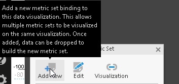
As an alternative, if the rows where Lost_Time=Y do not overlap with the rows where Recordable=Y, it is possible to select the data differently to combine them into a single metric set (Formula Visualization).
To do so, create two metric sets with the same dimensions (measures, slicers, and formula column) and filter the slicers as you need for each metric set. Next, create the Formula Visualization with a column that, for example, sums the formula columns of the original tables.
To create the Formula Visualization, you need to calculate such a column to be able to access the columns of the original tables. Then, hide any measure column that you do not need and re-visualize it to your chart.
In the following example, the aggregator of the SalesLastYear measure is set to count. Each metric set is filtered by DueDate, so they do not overlap each other and both have a Formula column with a formula like $SalesLastYear$*1000000000/$SalesYTD$


