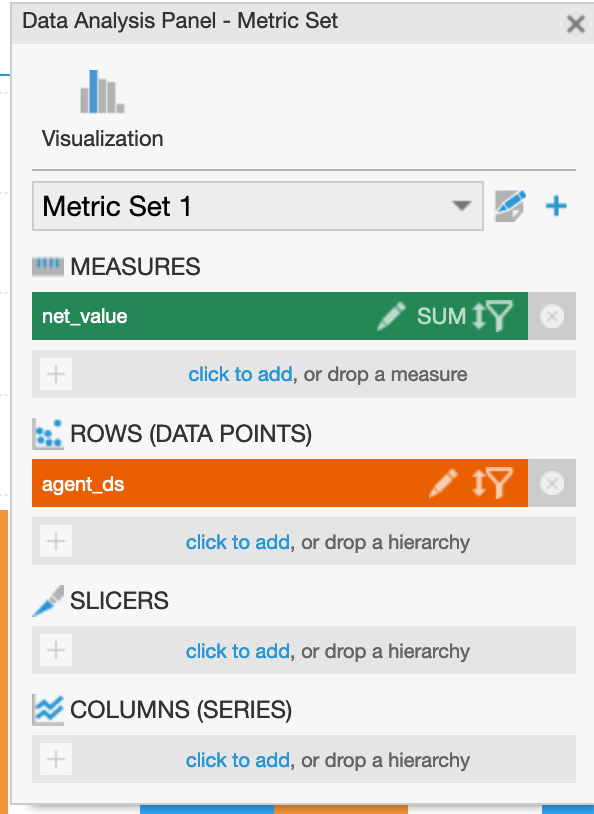
I have 2 measures at two different aggregation level.
Something like
Datacube 1:

datacube 2:

I also tried with a bar graph with two metric sets but i displays someting like this
thank you
I have 2 measures at two different aggregation level.
Something like
Datacube 1:
datacube 2:
I also tried with a bar graph with two metric sets but i displays someting like this
thank you
Hi Gianbattista,
Would you be able to further elaborate what you are trying to do? What is the end result that you are trying to achieve with the data from both these data cubes?
Furthermore, in the last line you say it displays something like this. Could you share a visual of the expected result and the actual result.
Thank you in advance,
Hi Matthew, sorry but i loose some images in posting.
this is the correct question:
have 2 measures at two different aggregation level.
Something like
Datacube 1:
datacube 2:
I need to have a result like this
Thank You
Hi Gianbattista,
I understand, there are a couple of things that I wanted to point out here to help you with your vision.
First, to have the “Agents” be grouped by each individual agent number, you would we able to do that by selecting the “Display with Row Headers" option in the Metric Set Toolbar. If you want each agent record to show individually then choose the "Display as a Flat Table option. This is how the table would be displayed with the “Row Headers” option as per your example.

Second, totals can be calculated using the Metric Set toolbar as well. Click on Shown Totals, and select the rows options.

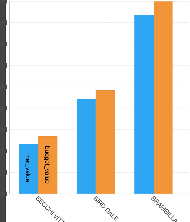
Now here is the tricky part. Since you are combining two table based on the Agent number, you are creating a one to many relationship. What this means is that you’ve got Agent 2 written multiple times in one of the tables. This will cause the budget to display on every row. If you try joining these tables you would get something like this

Ensure that you set the Budget aggregator to max. This is done by configuring the budget measure and changing the aggregation.
If you created a formula to calculate the Delta ($Budget$-$Income$) you would have all the calculated values in a final column (that I have renamed Delta). Dundas is not able to calculate using only the total or grand total values, this will create a new element for every row.

Because there is a lot of information listed in this table, and not all of it is relevant (such as having the budget listed every with every record). I have added a style to highlight the total records with the delta. I did this by navigating to the properties tab > Look > Rows > Total Row Style, and setting the background, Font Colour and Font Weight there.

Please let me know if this helps achieve your vision.
Thank you in advance,
I understand, I was hoping there was a simpler solution, merging two metric sets into a visualization or creating relationships between cubes, which dundas doesn’t do.
I saw that insering multiple metricset in a bar chart i can mix data from multiple cubes, but it works only if the axes have same values.
If i change rows of one metric set it doesn’t allign “correctly”
If I have to use sql then I think it is better to use UNION:
i make a select with agent, product, income, null as budget union agent, null as product, null as income, budget an then use it as a unique cube.