The Dundas Community was looking for some dashboard inspiration and we got some! A big shout out to @luis.silva and @semir.taletovic for sharing their work with us this month.
DASHBOARD #1 by @luis.silva

click on the image for a zoomed view
What was the problem statement for designing this dashboard?
I needed a dashboard that would show the budget execution for a Portuguese Local Government.
Describe the dashboard
The dashboard has small multiples on the top side, that is repeated for every “Organic Classification” of the expense budget. It also shows on the bottom, the overall execution of the expense budget aggregated according to three types of expenses (Specific for Local Government): Investment, Activities and Operation Expenses. Finally, on the right corner, it shows the overall execution of the revenue. The dashboard has a filter layer that you can activate by clicking the funnel image on the top right corner. In this layer, you can select different metrics and also select the “Organic Classifications” that you want to see.
DASHBOARD #2 by @semir.taletovic
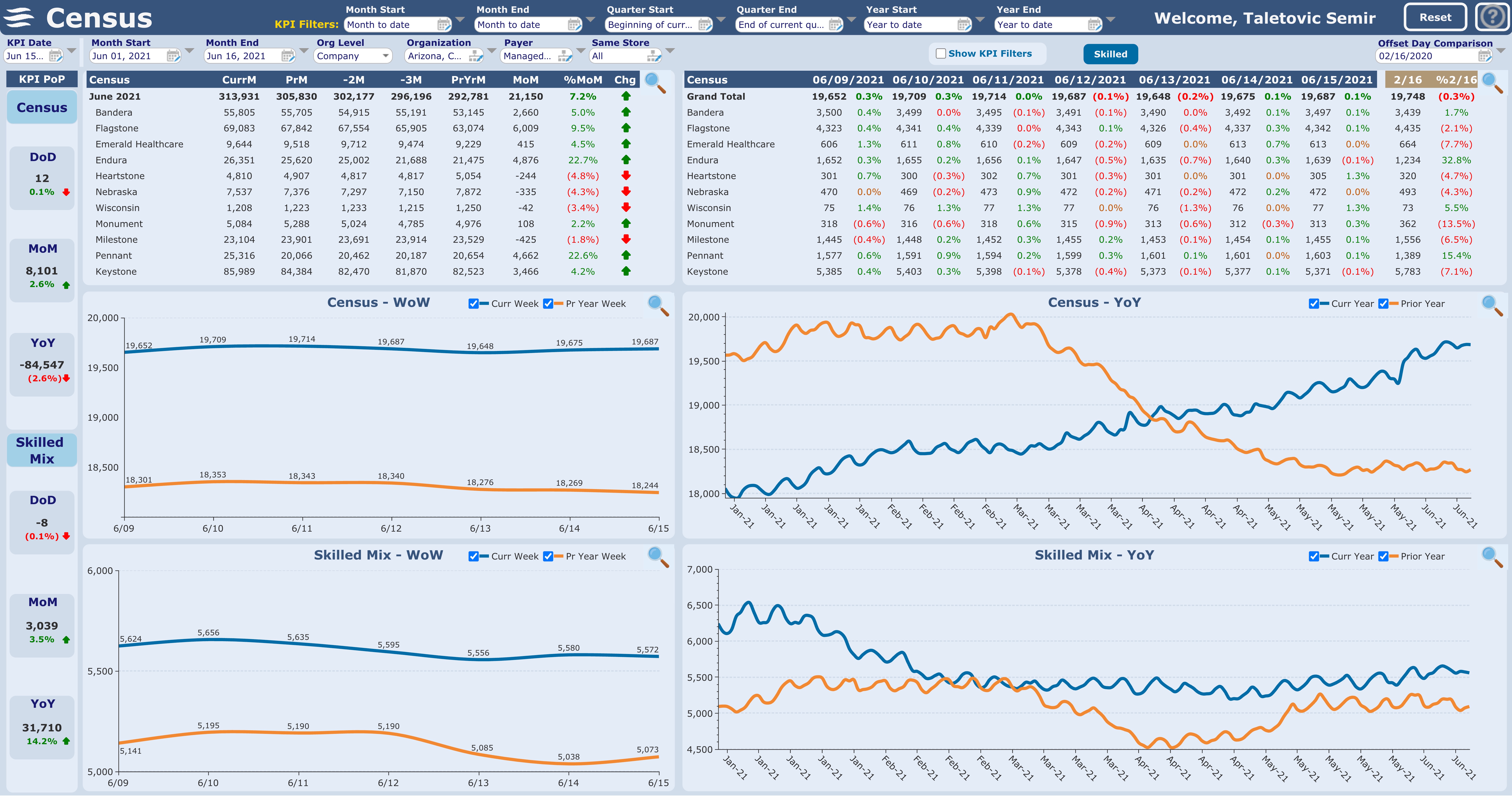
click on the image for a zoomed view
What was the problem statement for designing this dashboard?
Measuring patient population
Describe the dashboard
Measuring patient population (census) in our facilities on a daily, weekly, monthly, quarterly, yearly basis and showing corresponding parallel period trends.
Tell us and them in the comments below how do these dashboards inspire you.
Want your dashboard to be featured next? Keep an eye out for the July '21 submission activity.