I'm trying to chart the movement of a client through our hospital, and the "connecting lines" feature really helps to visualize their path. I currently have it set up to display a "bridge" style connecting line between range bars. They are all within the same series on the chart. The end date of each bar is the exact start date of the next bar. I couldn't find any documentation on how Dundas actually determines how these lines are drawn, and there are very limited settings avilable in the properties pane. The issue is that the lines are drawn inconsistently. As you can see in the image below, sometimes it works perfectly and sometimes it just doesn't draw a line at all. In some cases the lines will appear when the chart is zoomed in along the x-axis, in some cases it won't. That's why the red guy has a frustrated face. Does anyone have any idea what is causing this inconsistency and how to fix it?
Connecting Lines on a Range Bar chart
The Bridge option connects bars starting and ending at the exact same position. My guess in this situation is that there is a slight mismatch in the data.
Have you tried using the Between option instead? It should match your situation well, in my opinion.
There is no mismatch - the start and end dates of adjacent points are exactly the same, I can verify this by revisualizing as a table:
I tried the Between option, it seems to draw a line between the extremes of rows (the locations on the left axis) with no discernible pattern for a given connection:You are correct, in this setup Bridge would be the most fitting.
Your table dates don't match the dates in your original post where the lines didn't connect. Could you try to identify the exact location where the lines do not connect?
Sorry, I was using a different example, but the issue occurs on all of them. What I would like to figure out is WHY bridge lines are drawn in some cases but not others.
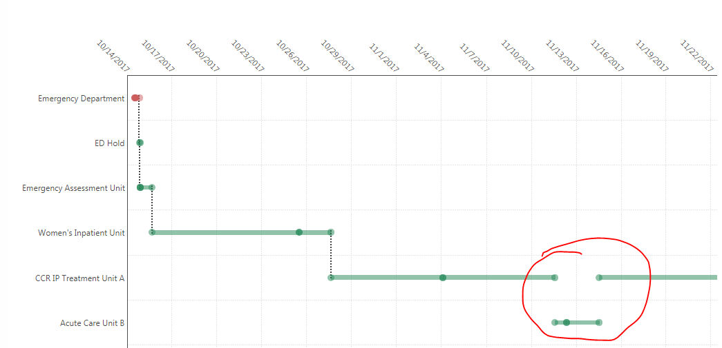
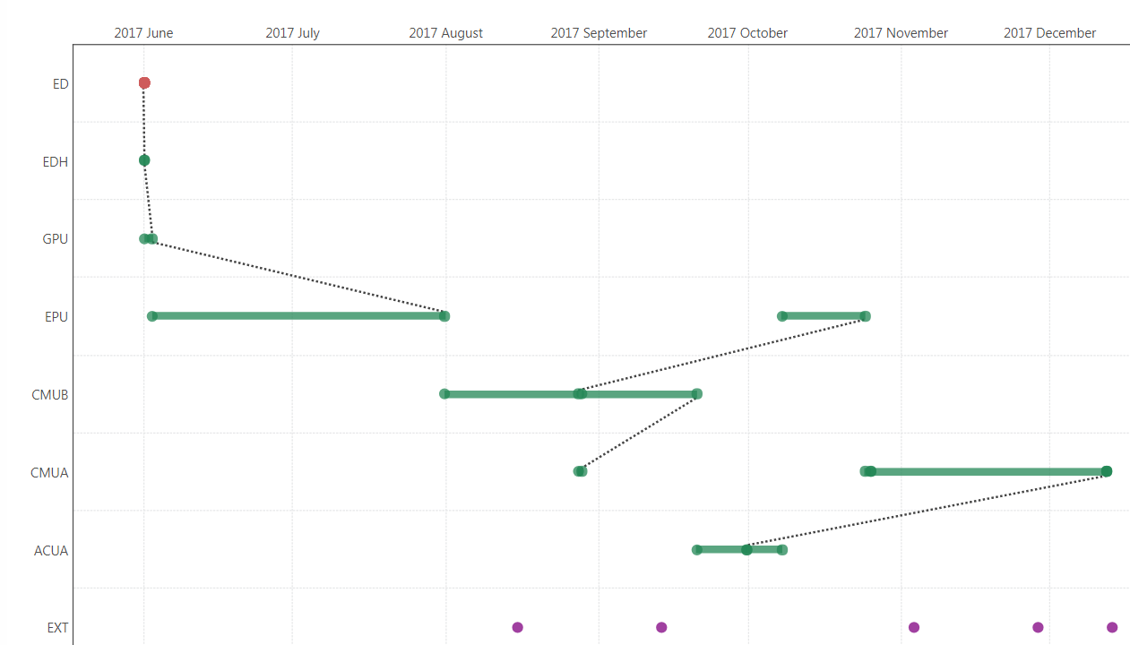
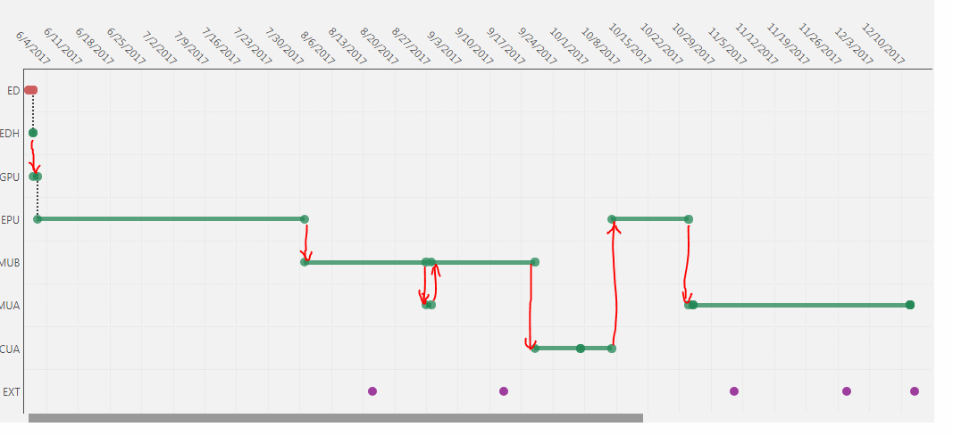
Using my 2nd example above, notice that Dundas successfully draws 2 bridge lines and misses all the rest. Why these 2 and not the others? All the dates "line up" perfectly - there is no overlap. I even tried using different levels of a date hierarchy to see if that would help (e.g. ignoring time granularity and setting the data points to the 'day' level) but it had no effect. The red lines indicate what I am trying to achieve, and what I would expect this "bridge" functionality to do:
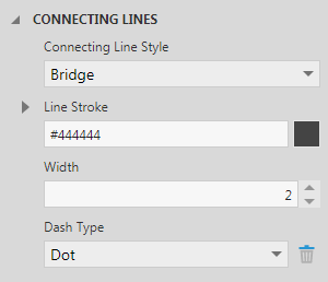
I played around with zoom/scale/size properties in both Dundas and Chrome&IE but still no solution. I also tried changing the connecting line width to something ridiculously huge, but still no change. I'm starting to think that the lines are actually "there", and the issue is just with how they display (i.e. they don't render properly on screen). I could be wrong, but here's why I think that:
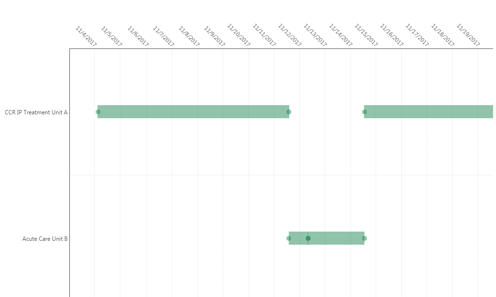
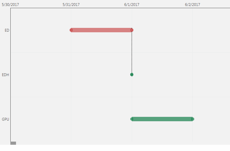
Zooming in on the first section (June 1, 2017), I can see that one of the lines appears and one does not (just like in the original zoomed-out screenshot):
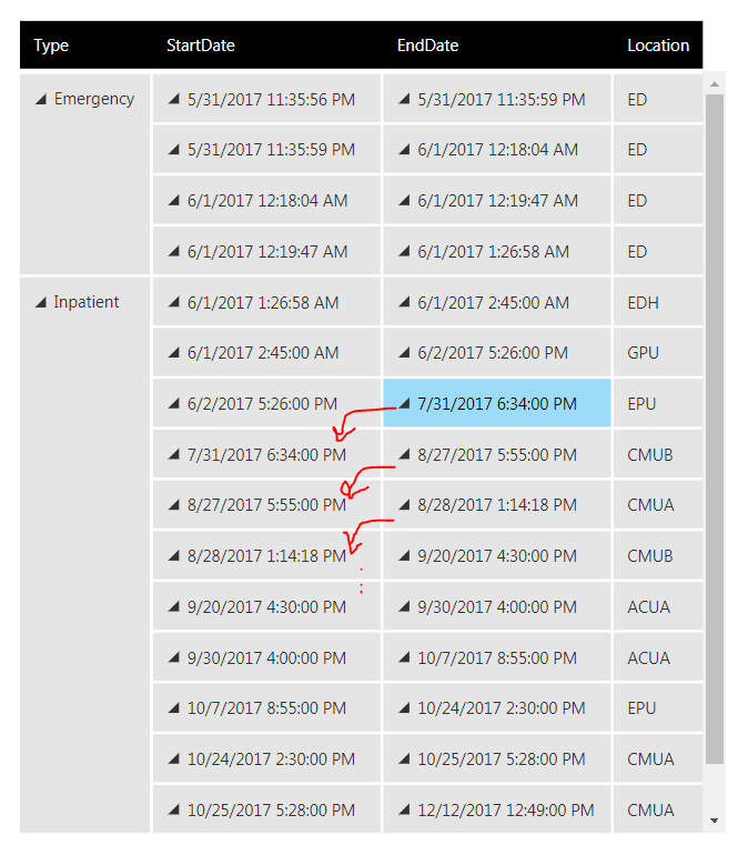
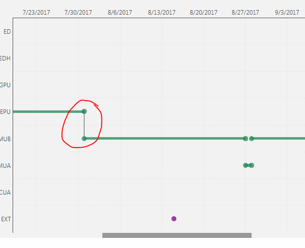
Zooming in on another section (Jul 31, 2017) I can see the connecting line magically appears (where it did not appear in the original zoomed-out screenshot). But the line that should appear for Aug 27 still doesn't show up. However, what I noticed is that as Dundas animates the zoom-in, the missing line at Aug 27 appears momentarily before vanishing. Any further zooming has no effect.
So I need to figure out what is going into the "decision" DBI makes as to whether to display a line or not. I don't care if they don't show up at each and every zoom level. I just want them to show up completely and consistently.
The connecting lines functionality was designed for waterfall charts. It's essentially a stacked bar, and only the top connects to the following "adjacent bar". Since you are using range bars, the definition of "adjacent bar" is more difficult and unfortunately this is as much as I can give you about the "decision."
For a Gantt chart (which is what you have), the connecting lines can work for only specific setups. The lines you are trying to connect have to cross up and down over multiple elements, not just the "adjacent bars." Such lines are usually dependency arrows, and I have added you as a submitter to a feature request for this functionality.
Ok, thanks for the reply Elia. I'll have to accept that I'm trying to use this feature for something other than what is was designed to do.
What's still bugging me is that even if we apply this definition of "adjacency" it still doesn't explain why some lines appear and some don't. The first 5 instances of connecting lines on the example above are all similarly adjacent bars (with a single, non-overlapping, downward step exactly as you would expect in a waterfall chart). Somehow DBI has determined that it will display 2 of these 5 lines (and 3 when zoomed in).
Yes, that's why it took me so long to reply initially. However, this definition of adjacency is for waterfall charts and doesn't fully transfer to the range bars (which is why zooming in changes what is considered "adjacent").