Hi,
I'm asking this question because I have 2 cubes, in one I have a measure lets call it airfare and I need it in a metric with dates in the rows, all this for a project (lets say this is my filter) and then in the second cube I have another metric lets call it flights, but this one is the same for all the dates (I only have one row per project) and I need to do a calculation of Airfaire/flights (but the Airfaire is the sum of all the rows) and the flight its just always the same, but when I try to do this from the dashboard I always aggregate the flights columns and it end up being more than the value that should be. This its kind of the same that would happend if I do a join of both cubes in another cube, because its going to put me a flight value for each row of the Airfaire.
I tried doing 2 different metrics in the dashboard and the doing a formula visualization, and that worked, but the thing is that I have to do the same that I'm doing for Airfaire and flight for more colums, and this result should be in only one graffic.
I'll try to show you what I have and what I need.
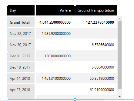
This is my data from one cube for lets say project X (there are more projects)
Then this is the data form the other cube for Projec X
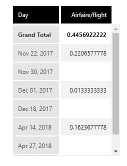
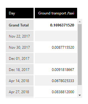
 And this is what I want:
As you see this works ok, but I need them in the same metric set as a lineal chart, that's what I thought of doing the formula in the same metric set. But if there is a way of showing multiples formula visualization on the same chart that would also work for me.
Could you please help me with this?
Thanks..