Calendar Visualization

Has anyone created or know if it’s possible to create a visualization of a monthly calendar in Dundas? I have a user who would love to be able to visualize kind of a heat-mapped calendar based on data (i.e. red for higher activity days, etc). While I realize Dundas is probably not the ideal tool for this, they would like it integrated into the rest of their dashboard, so trying to see if it is possible.

Thanks!

I am thinking Tree Map.
If you can by date get a count of activities per day then you can put this in a tree map and see if it is what he is looking for.
Usually a tree map ordering is based on value but you can try to see if you can get to order by date (might have to turn the day of the month into a value and order by descending) but still use the count of activity for size and color.

Hi @molly.loughran,

I created such control using the Small Multiples control in Dundas BI 6.x+.
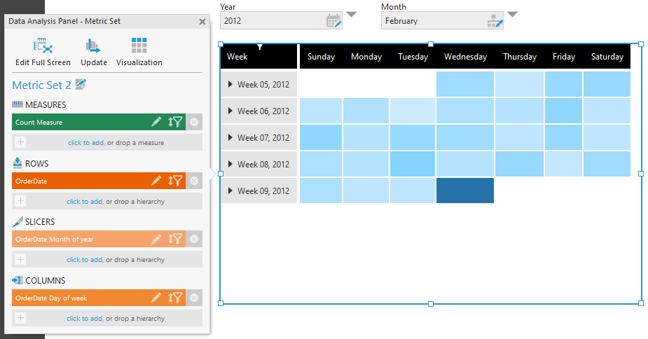
Sample

It’s a little be complicated to make as you have to have all of the dates also coming from your database but it’s certainly possible if you’re willing to get the data structured properly.

Here’s how I did it.

  1. Create a Manual SELECT to SQL to generate the dates you want to see.

Here is the query that I used to do this:

WITH Dates AS (
SELECT
[Date] = CONVERT(DATETIME,‘01/01/2018’)
UNION ALL SELECT
[Date] = DATEADD(DAY, 1, [Date])
FROM
Dates
WHERE
Date < ‘12/31/2018’
) SELECT
[Date], DATEPART(WEEKDAY, [Date]) as [Day of Week], DATENAME(WEEKDAY, [Date]) as [Day of Week Name], DATEPART(wk, [Date]) as [Week of Year], DATEPART(dd, [Date]) as [Day]
FROM
Dates
OPTION (MAXRECURSION 365)

  1. Join this dates table (using FULL join) against your source data.
    image

  2. Create a small multiples object and build a calendar.

image

Upper Middle Cell:
Data Label to Show the Days of week

image

Center Cell:
Data Label to Show the Day Numbers in the top right corners

Center Cell:
Put any visualizations you want to see. In my case, i wanted that heat map colour effect and one way to do it was to put single point bar charts in every cell.

To make the bar appear like this, turn off the X and Y axis and change the maximum of the axis scale to 1 so that the entire area is filled with your bar.

Use Colour rules to colour the bars:

Hope this helps. To be honest, i should probably create a video on this at some point as I imagine all these steps are probably difficult to follow in this format.

2 Likes

Hi,

For a heat map, you can use a regular table visualization for this, or there are also ways to use a chart instead with the Point chart type, for example. A small multiple is helpful if you want to go beyond changing the colors of the cells/points (a heat map) and add additional details that you can’t accomplish in a table or chart.

There’s no need to use a query for this when we have the built-in time dimension attribute “Day of week”, which you can put on Columns in the Data Analysis Panel. You can put the regular Week level of a time dimension hierarchy on Rows, and use filtering to choose a month (for example).

If you did want to display a number with the day of the month (you might not), you can use a formula like this that refers to the date from the start of the week and then adds to it based on the day of the week:
$OrderDate$.MemberTime.Day + $OrderDate:A0$.MemberNumber - 1

1 Like

This great. In a take off of this I want to create a filterable calendar which would show project assignments for a resource with the day being colored in from light to dark to show overloading. The issue I am finding is putting the “day#” in the top left hand corner and then adding in what could be multiple assignments to each day. I would need to do the coloring based upon the total hours assigned for each day. Has anyone tried this?

Hi Keith,

Are you saying you would have multiple metrics? I think a picture of what you are thinking would benefit my understanding at least.

Sounds to me like you might need to go with the small multiple approach that I provided but again, i could be unclear.

How about something like this:

I’ve done something similar for employees holidays:

A table with the date on columns and employees on rows. The cells are painted based on states (could be counts of activities).

1 Like

Has anyone managed to to create a hit test like script that returns the date the user has selected into a variable?

Hi Shane,

Here is a sample i used:
image

I was able to access all the data needed using this script, on click.

var row = e.relatedData.rows[0];
var column = e.relatedData.columns[0];

var date = table1.metricSetBindings[0].dataResult.cellset.columns[column].members[0].caption;
var revenueValue = table1.metricSetBindings[0].dataResult.cellset.cells[row][column].value;
var continent = table1.metricSetBindings[0].dataResult.cellset.rows[row].members[0].caption;

I’m sure there are other ways to do this, but this should work for you.
Hope this is helpful

2 Likes

Brilliant, thanks Jeff!

Hi Jeff,

I think this was the best answer I was looking for, very clever.

Thanks !