Hi Helge,
You can certainly have standard users manipulate the axis via script and have that triggered by the user on a button click or using other actions such as value changed for a slider. An example for such script is detailed below but please keep in mind that there are at least two other options using the built-in interactivity that you may want to consider as those don’t require any script:
-
Zoom – Users can always select a set of data points on the chart and zoom in and out of those using the context menu. Note that with this option you will get a scrollbar on the axis and users will also benefit from the option to focus on the data points of interest along the bottom axis as well (vs. always looking at the entire range).
-
Visual Filter or Numeric filter – Users can simply select the outliers they want to filter out, open the context menu and choose Filter à Exclude Selected. This will filter out the outliers and will also modify any derived calculation (i.e. average or trend) to compute solely using the remaining data points. Note it will be similar to exposing a range number filter and connect it to your measure.
If you rather use a script – here are some sample steps for a script that will allow the users to manipulate the axis using a slider:
- Add a slider component to your dashboard.
- Add the following script to the dashboard “Ready” action (note you may need to adjust the script to use right chart and slider script names).
// set the maximum of the slider to the maximum value of your chart y axis and move the slider to that value
slider1.control.valueMax = chart1.control.yAxis.actualMaximum;
slider1.control.valueFirst = chart1.control.yAxis.actualMaximum;
- Add the following script to the “Changed” action of your slider.
chart1.control.yAxis.autoMaximumUpperLimit = slider1.control.valueFirst;
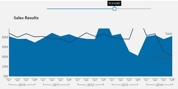
The end result should look similar to this:

A couple of notes to add:
- The slider values is set upon the initial dashboard load but if you have a set of filters the user can use to filter the chart, you should place the script under step #2 in the chart “Data Changed” action as well so the slider resets every time with the new axis values that correspond to the new filter values.
- The slider has a value step property which is by default set to 1. You may want to change that if you want the user to be able to change the values in bigger increments.
Let me know if that helps.


