Aligning arrows to stacked bar segments

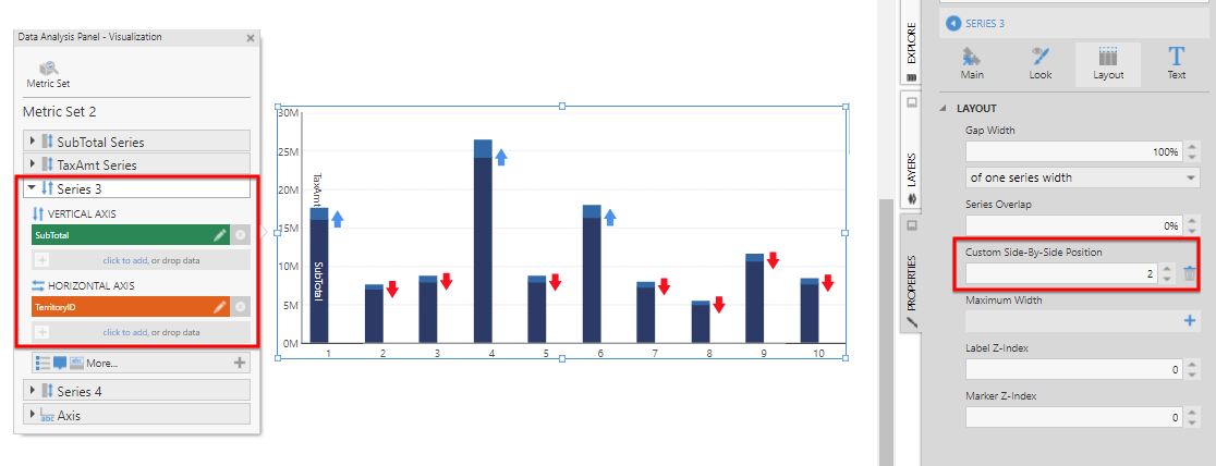
I have to recreate the following

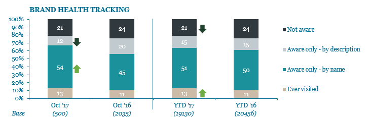
There is a statistical test that I do on the data that determines whether there needs to be an up arrow, a down arrow, or no arrow at all next to each section of the current period stacked bar column.


I can do the test in a script, and I can insert the correct arrow image on to a dashboard. What I am having trouble with is determining the position of the arrow image. I could perhaps hard code the left position although I would prefer not to, but I need a way to script the top position.


Is there any way (however convoluted or stupid) to work out the center Y position of each segment of the stacked bar? For a bonus, is there any way to work out the X position of the column edge?

(I cannot determine using the chart height, because the object includes the x axis too.)


All ideas welcome!

There are methods on the chart to get the position of any value. You can use this one:

http://www.dundas.com/support/api-docs/js/#API%20Reference/dundas/controls/Chart/Methods/valueToPixel.html


In a stacked chart, the Y value will be the stacked total, which you can either calculate or get from the getPlottedYValues method:

http://www.dundas.com/support/api-docs/js/#API%20Reference/dundas/controls/ChartSeries/Properties/chartTypeInstance.html

http://www.dundas.com/support/api-docs/js/#API%20Reference/dundas/controls/ChartTypeBase/Methods/getPlottedYValues.html


The position of the bar along the X axis will be its centre. The method getPointSize will return the bar width in pixels:

http://www.dundas.com/support/api-docs/js/#API%20Reference/dundas/controls/ChartTypeBase/Methods/getPointSize.html


With all of this said, you could plot the same thing without scripting:

  1. Add another series to the chart (either in Data Analysis Panel - Visualization or in the Properties panel)
  2. For the new series, change the Chart Type to Point
  3. In the Layout properties, set the Custom Side-By-Side Position
  4. Use states to define the marker and color of the point series

The only problem with this solution is the measure to use for the vertical position. You can see in the screenshot that I used SubTotal to place markers for the TaxAmt for this example. You will probably have to add a formula that aggregates all the segments below. So, in the case on your screenshot, it will be four formulas with four new series.

Thanks Elia - I will try this.


I think it will have to be a script because the data is coming from different sources that are almost impossible to combine. I can only work with what the client sends me, and they are not the easiest!