2 graphs on 1 radar chart

I have a data set (related to sending and opening messages) with 4 columns:

  • 2 dimensions:
    – send_date
    – open_date
  • 2 measures:
    – open count (makes sense when related to the open date)
    – open rate (makes sense when related to the send date)

I am looking at weekly patterns, so I am trying to build a radar chart with the day of the week/hour of the day in the angular axis.

It works very nicely when I display only one of these data.

I am trying to have both measures (open count vs open date as well as open rate vs send date) on the same graph. They will both have different radial and angular axis (although the angular axis will conveniently look the same). Is it at all possible?

What I did:

  • In the data analysis panel
    – add open count and open rate as measures
    – add sent and open dates as dimensions
  • In the visualisation panel:
    – have series 1 with only open count and open date
    – have series 2 with only open rate and send date
    – only 1 angular axis has labels (but both series using their own axis)

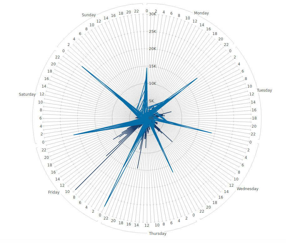
and this is the result:

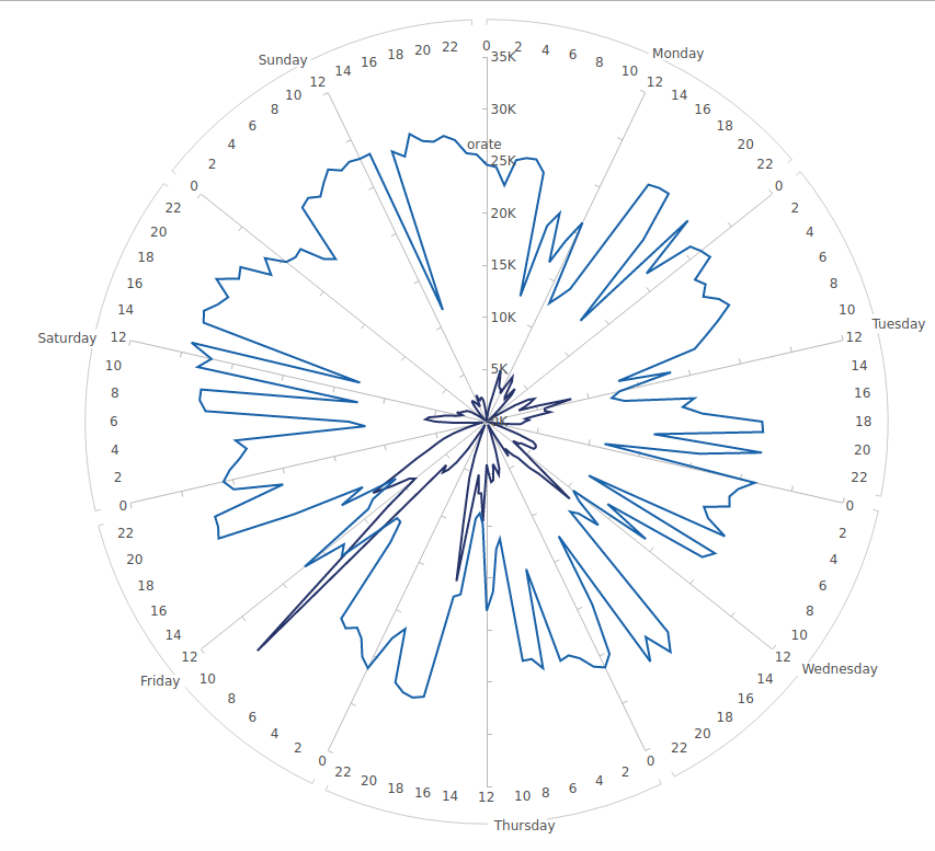
This was what I had with only 1 series:

The differences are:

  • now instead of joining each data point to make a nice looking shape, it seems that all data points are bound to 0
  • the light blue (series 2) does not look like anything, with data which seems to cross the circle.

Is what I am trying to do at all possible? If so, what am I doing wrong?

Hi Gauillaume,

Whenever you see something unexpected, often the best first step is to see exactly what’s shown in Data Preview for the current metric set. The lines can only change shape as shown here if the rows of data changed, which each become a data point in the line with those points drawn in sequence. The order of the dates seen in Data Preview become the order of the points of the lines.

For example, adding both of these date dimensions to one metric set could have a result you didn’t intend, like if for every single Open Date there are multiple Send Dates. Also, if the data is sorted by Open Date, the Send Dates could be out of order, depending on your data.

Option 1: Charts are able to plot two independent metric sets when working with one on a dashboard or other view, which means each metric set can have an independent set of dates in order. If you click the + button in the Data Analysis Panel, you can drop Open Rate and Send Date on a separate metric set, leaving only Open Count and Open Date in the first. Each metric set would have its own series.

Option 2: If you want one time axis and one metric set, you most likely need one set of dates with the two corresponding measure values beside them. You can do this by joining on the dates, but keep in mind certain tricky things about joining data in general:

  • Unless you know that for every Open Date you’re guaranteed to have a matching Send Date, you could not use our relationships and “auto-joining”, which does an inner join and would exclude rows. You can set up a full (outer) join in our data cubes.
  • Also be sure there aren’t any duplicate dates, since this can lead to a multiplication of rows. In that case you may need to aggregate first by Day.
  • When outer joining, our Merge data cube transform can merge the two date columns into one and remove the null values.

Hi Jamie,

Thanks for this. I learned a lot form your answer - double metric set and metric set preview, I actually never saw those before.

2 metric set was not ideal for me, so I went with tweaking my SQL to have both data set bound to the same axis, which works fine.

There is just one thing. This is my current radar chart:

It has one axis shown (up to 35k, this is radial axis 1) but I cannot make the second radial axis appear. It is configured as the first one but no matter what I do it doesn’t show. Is there a way to have 2 axes on 1 radar chart?

Hi,

You can have multiple axes to position data points along different scales, but only one radial and one angular axis can be visible. If the values are very different so that you don’t want to plot their values directly along the same axis, you might consider turning them into a percentage of their range using a formula:
($Measure$ - BOTTOM($Measure$)) / (TOP($Measure$) - BOTTOM($Measure$))

(In the axis text properties, there is a Format that can be set to P0 to display this as a percent. If the axis wants to round up beyond 100%, you can un-check Round Minimum & Maximum.)

Thanks Jamie, that’s a really good tip.

I am not sure it will fit in my case (one is a percentage which can go from 0 to 100, the other, even if normalised, would still not have the same data range) but at least I know why.