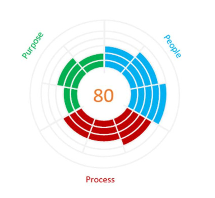
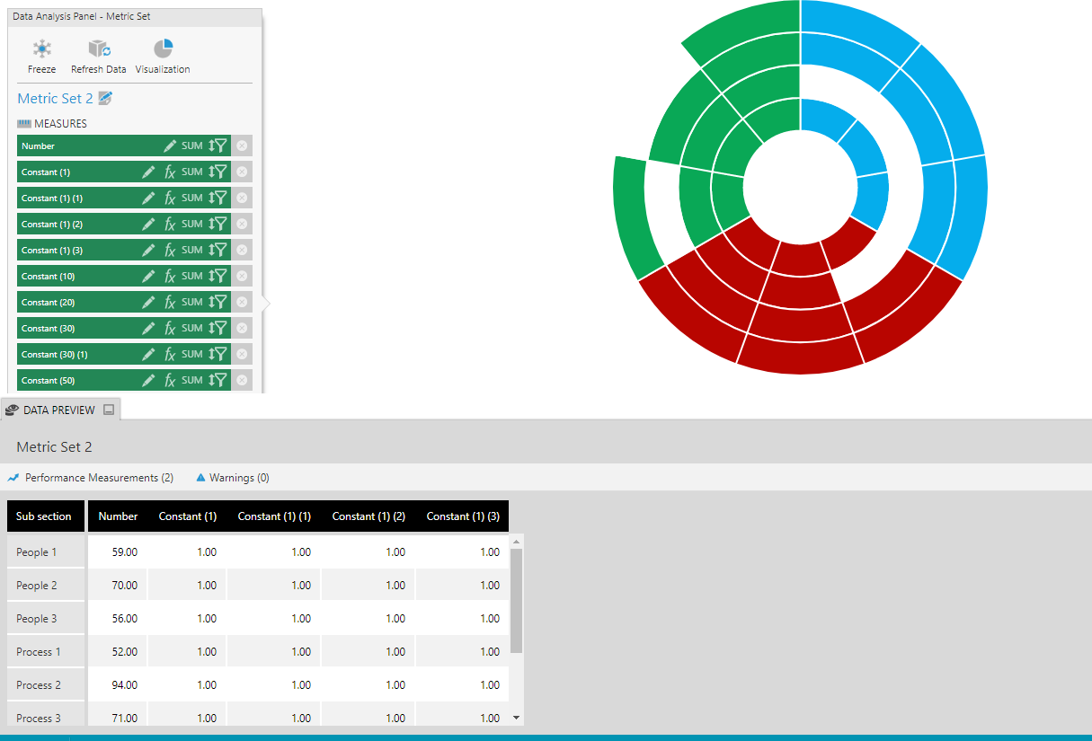
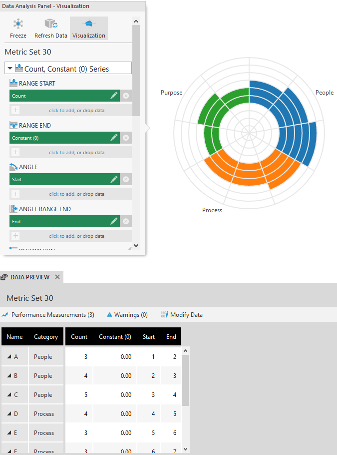
The values are representing scores that people gave for each section.
It’s not the going round the circle that is important, it’s the distance that each bar goes from the middle. So if you were with a perfect circle around the outside, then your company is balanced on all metrics. If it’s far out in one place and not in another, it means that people perceive your company to be more of one thing than another. It’s the effect of seeing the whole blob of colour moving towards one side of the circle.
We see this quite a lot with our market research clients, they have their categories and subcategories in a very specific order around the ring so that they can see which areas they’re skewed towards.
I think this gives all the metrics an equal balance as they all start and end in the same place from the centre visually, which is not exactly the same effect given by the bar/column chart.
It’s a different use of the radar from the one mentioned by @james.davis, maybe it’s market research industry specific rather than BI.