I have submitted this to support, but wonder if anyone else has done anything like this?
Hello,
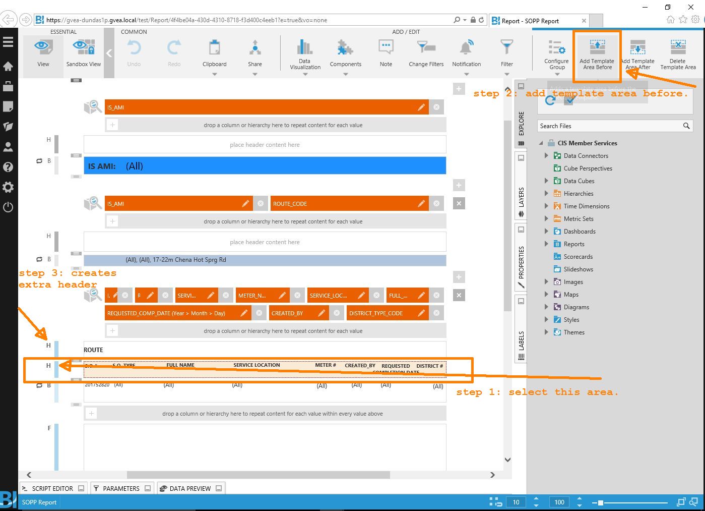
I’m trying to reproduce a report currently created by Oracle Reports, although the preference is to use the Excel share instead of a the pdf that they had. I’ve got most of it worked out, but one of the requests is to group the data by ROUTE_CODE (as seen on the screenshot, which is relatively easy to do in Oracle Reports) but to either have blank lines between the different groupings or be able to display it like the pdf shows.
I could use some advice on how to do this or if it is even possible. (Note the data sets are different, it’s the formatting based on ROUTE_CODE I’m interested in)
Oracle Report, note how the route is a light blue bar above each set of records for it:

My Excel file thus far. I don’t need to have the routes grouping above each set, but some kind of visual / physical separation would be nice, not color-coding though: