Hello, this is my first dashboard. I am tasked with copying an existing one. My question is how to get the rows to list repeated values once without the expansion handles/arrows. Here is my goal:
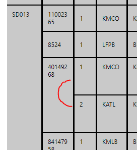 but when I bring the metric set in, it is coming up with the arrows. Thoughts? Thanks Kristi (Also, feel free to point me to a video or doc that covers this and how-tos on working with a grid format).
Dashboard Table Column Display
1 Like
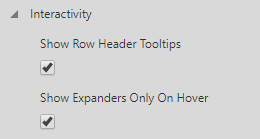
In the table’s properties, under the Main tab, there will be an Interactivity header. Expand that, and then check the Show Expanders Only On Hover checkbox
1 Like
Thanks Christian! I found it and it worked! (It is all about the scrolling down! LOL)
Does anyone know how to make the rows appear as in the original picture provided? Thanks!
1 Like
It looks like it has a lot of custom styling done.
Is the original a Dundas table?
If it is you can go save the style then apply it to your new one. If not you will have to go style the Dundas one.
https://www.dundas.com/support/learning/documentation/data-visualizations/using-a-table-visualization
There is a lot in the table that you can change, once you get it right I highly suggest you save it as a style.
1 Like