Hi all,
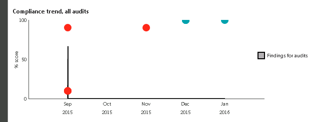
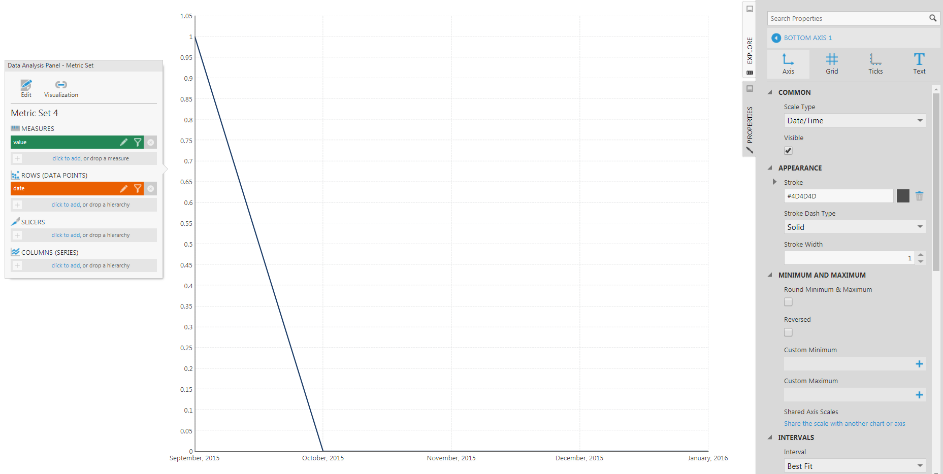
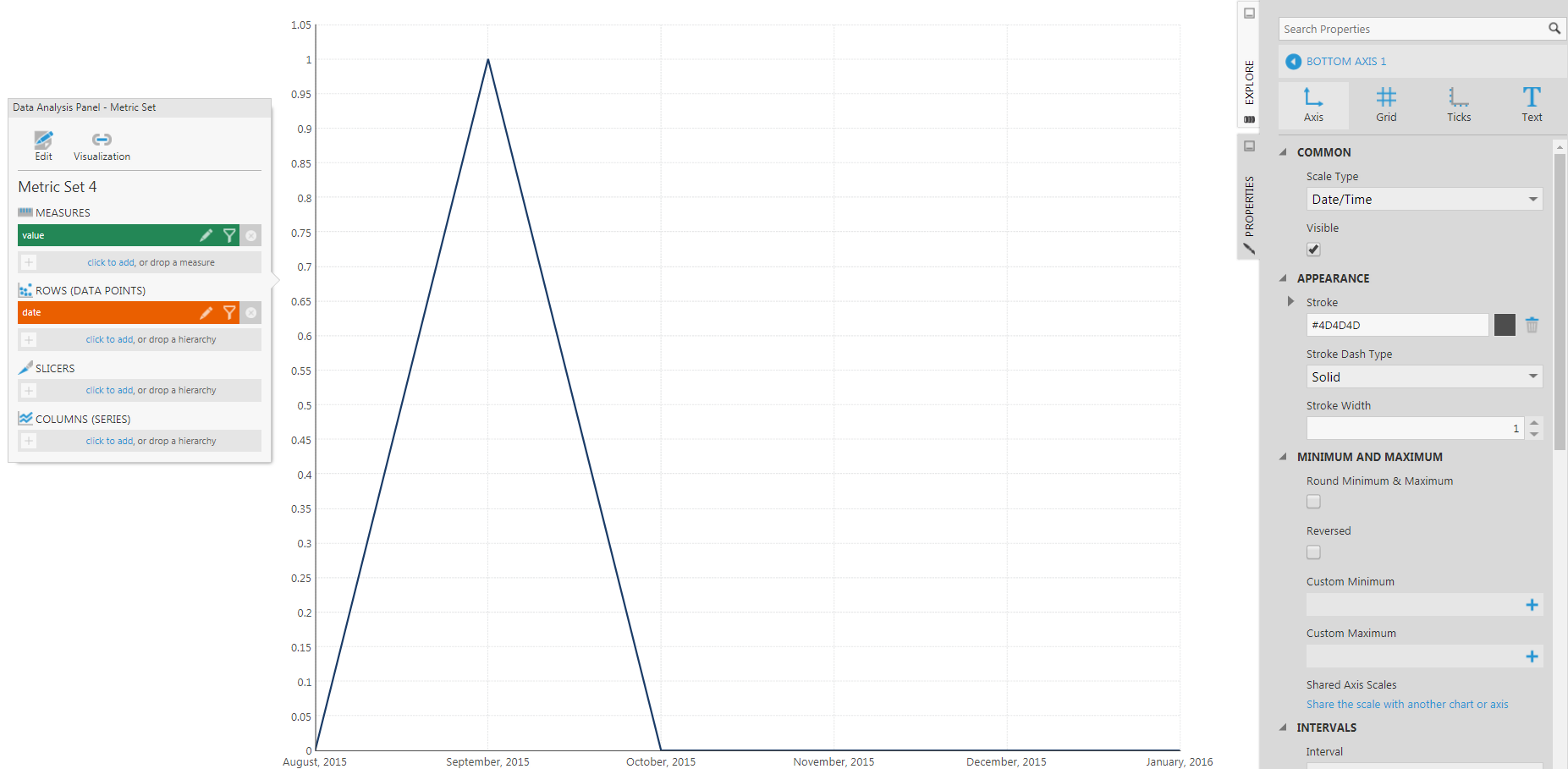
I've got an area chart in one of my dashboards that appears to be displaying the correct data, but it's doing it in a way that I find odd. The chart is a count of records vs the date they were created, using months as the interval. I've got 0 records in most months, but one of them (September) has 1, so I'd expect for this trivial case, to get a triangular formation in the chart, with August (Which is actually at the y-axis) and October at 0, and then a line going up to 1 for September. What I get is a sort of inverted T shape. The line goes up for September, but it seems to go up straight from the September tick, and straight back down again. There is only data for the 1st of every month. I can sort of see why the chart looks the way it does, but it's not what my users will expect to see. The x-axis is defined as a date/time axis right now, and I've tried changing it to other types, but none of them seem to do what I expect either. I've included a screenshot below. I'd expect a triangle from the origin to (Sep 2015, 1) and down again. The area chart is a second series laid underneath a bubble chart, so fiddling with the axes might have knock-on effects. I hope I'm explaining this well enough and that someone out there can see what I mean.